Responsive Web Design Explained: Why Every Developer Must Master It
 Hardik Gupta24 Jul, 2026
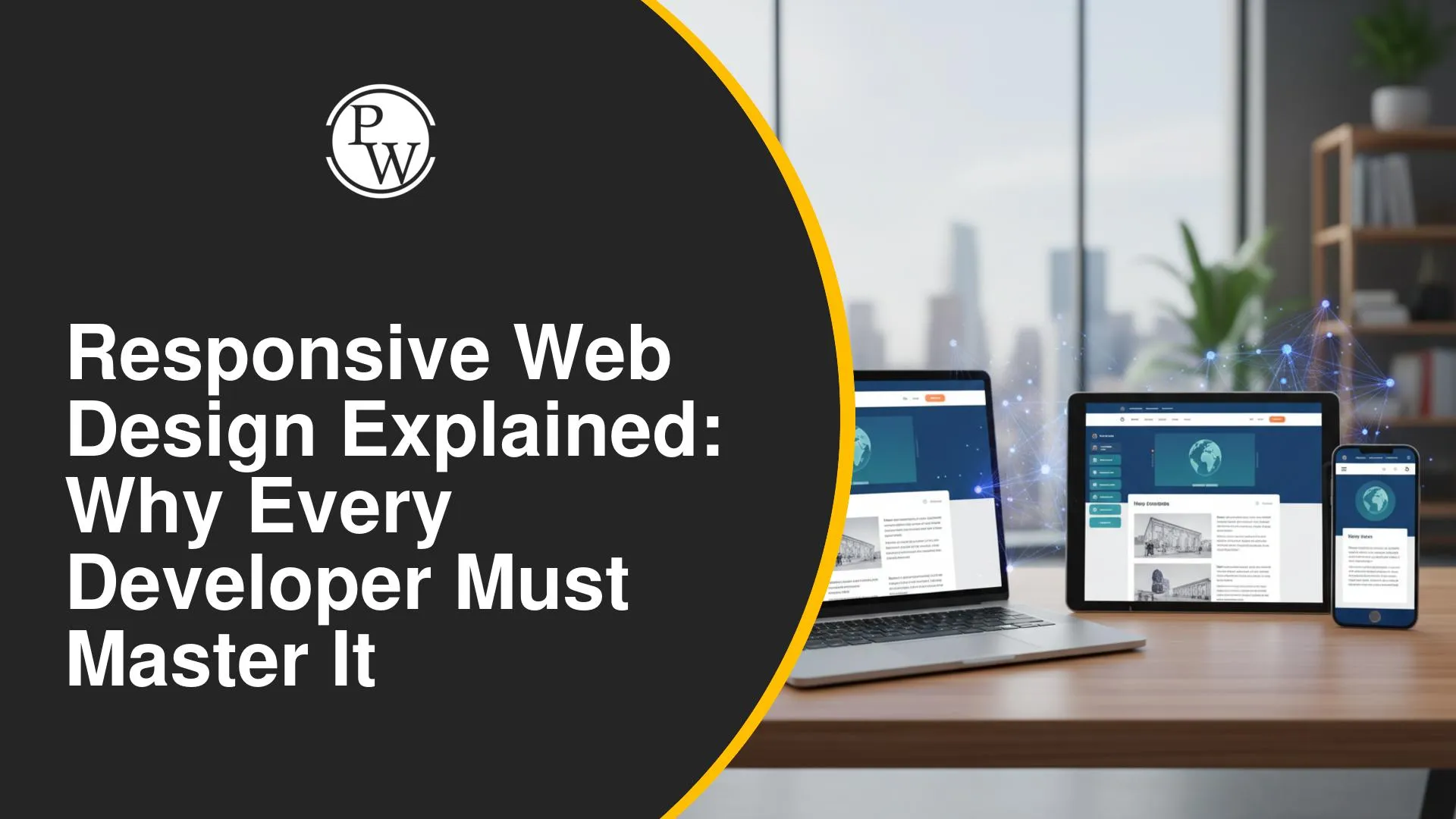
Responsive Web Design (RWD) is an approach to web development. It makes web pages render well on a variety of devices and window or screen sizes. This ensures an optimal viewing experience, including easy reading and navigation. Every developer must master this technique. RWD is essential for user engagement and accessibility across all digital platforms today.
What is Responsive Web Design?
Responsive Web Design means building websites that adapt dynamically. Layouts change based on the device accessing the site. Key components include fluid grids, flexible images, and media queries. Fluid grids use relative units (like percentages) instead of fixed pixels. Flexible images resize proportionally within their containers. Media queries apply different styles based on screen width, height, or resolution. This ensures content looks good on desktops, tablets, and smartphones.
Why Every Developer Must Master It
Mastering Responsive Web Design is not optional; it is a necessity for developers today. It directly impacts user experience, providing accessibility across diverse devices. Good responsive design boosts search engine optimization (SEO). Search engines favor mobile-friendly websites. It also makes development more efficient. Developers maintain one codebase instead of separate versions for different devices. This reduces development time and costs. Responsive skills are highly valued for any Full Stack Development with AI Course + MERN Stack Developer Jobs.
Key Principles of Responsive Design
Responsive design relies on three core principles. First, a fluid grid system uses relative units, making layouts flexible. Second, flexible images and media scale automatically to fit their containers. This prevents content overflow. Third, media queries allow developers to apply specific CSS rules. These rules activate based on device characteristics like screen width or orientation. Understanding these principles helps build adaptable and user-friendly interfaces.
Responsive Design in Full Stack Development
For Full Stack Development with AI Course, responsive design skills are paramount. Full stack developers build both front-end and back-end systems. Ensuring the front-end adapts seamlessly to all devices is a core responsibility. Developers learn how to integrate responsive principles from the ground up. This involves using frameworks like Bootstrap or implementing custom media queries. These skills are critical for securing MERN Stack Developer Jobs, where creating versatile user interfaces is a key demand. A strong grasp of responsive design elevates a developer's profile significantly.
AI-Assisted Coding for Responsive Design
Artificial intelligence is changing how we approach web development. AI-assisted coding tools can help in creating responsive layouts. These tools suggest code snippets, automate repetitive tasks, or even generate entire components. For a Full Stack Development with AI Course, learning to use these tools effectively is beneficial. They can speed up the responsive design process. AI can also analyze design patterns. It helps ensure better adaptability across devices, improving development efficiency and accuracy.




FAQs
Q1. What is the main goal of Responsive Web Design?
Q2. Why is responsive design important for user experience?
Q3. Does responsive design affect SEO?
Q4. What are fluid grids in responsive design?
Q5. Is responsive design relevant for MERN Stack Developer Jobs?





 Live & recorded classes available at easeDashboard for progress trackingLakhs of practice questions