
Jquery UI - Overview, Tutorial For Beginners
You can use the jQuery UI framework available with jQuery to apply pre-built design components, effects, themes and much more in your user interface design of your web application. Learn more about jQuery UI in this blog.
 Varun Saharawat30 Oct, 2025
JQuery UI is an user interface built with the JQuery Javascript library with themes, widgets, and interactive effects. When you are building web applications you can choose JQuery UI for designing the interface of your application. Hence, you can use JQuery UI in designing the frontend interface of your web application.
In this article, we will learn more about the uses of JQuery UI and also get familiar with how we can use JQuery UI in our next web development project.
What Is JQuery UI?
jQuery UI is a Javascript library which is built over jQuery and provides a collection of pre-designed user interface (ui) components, widgets, effects, and more. This framework is used to fix your website frontend and make it more interactive and user friendly. This is an open source library with different animations, widgets, pre designed themes, and other components. This library is very easy to use and integrate in your application. It can be used on any browser easily.
Key Features of jQuery UI
Let us get our eyes on some of the catchy features of jQuery UI below.- It provides users with pre-built UI components such as datepicker, accordion, slider, autocomplete, dialog, progressbar, and more.
- You can easily interact with jQuery UI using draggable, droppable, resizable, selectable elements.
- With jQuery you can implement effects and animations using bounce, drop, explode, highlight, puff, and other effects.
- You can easily style your user interface with Themeroller that can create customized theme for your application.
- jQuery UI is one of the jQuery library used to help developers in implementing fast and attractive user interface design.
- You can easily apply a theme by integrating the CSS file within your project file.
- You can also use theme class to integrate a particular theme, widget or other components directly into your web development project.
How to Download & Install jQuery UI?
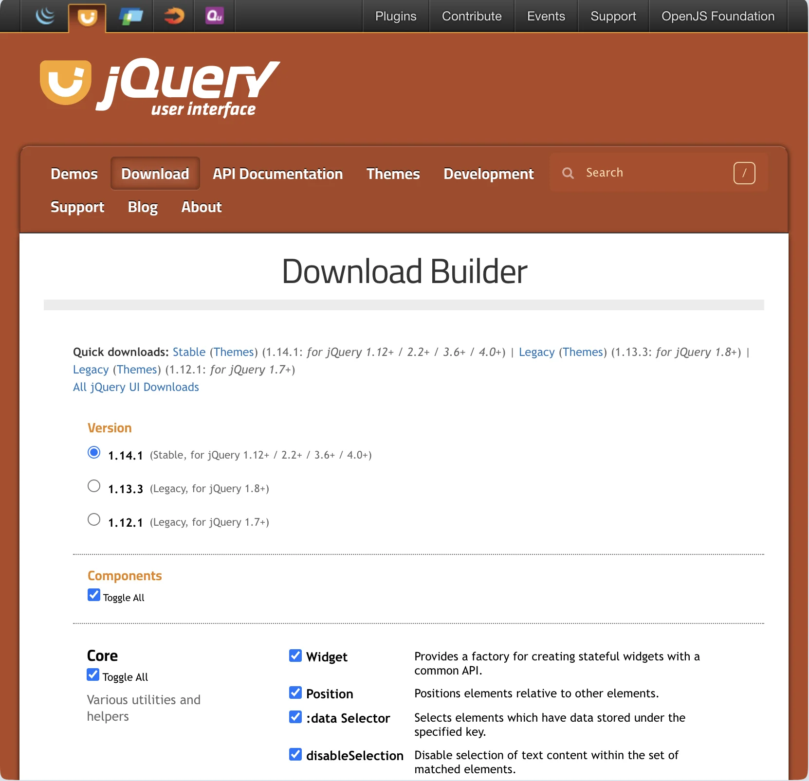 jQuery UI is an open source library available in jQuery and can be downloaded and installed for free on your device.
- Step 1: Go to the official website of jQuery UI and search for the Download option.
- Step 2: Select the latest and stable version on the download section of jQuery UI.
- Step 3: Select the themes, effects, widgets, interactions, core components for your application as they will also be downloaded on your device.
- Step 4: Your zip file will start to download on your device with the name jQuery ui 1.4.1 custom zip.
- Step 5: All themes and other components will be downloaded on your device with js file, css, images and readme files.
- Step 6: Now, its time to link the file like index.html to the head section of your web application project.
| <link href="https://code.jquery.com/ui/1.10.4/themes/ui-lightness/jquery-ui.css" rel ="stylesheet"> <script src="https://code.jquery.com/jquery-1.10.2.js"></script> <script src="https://code.jquery.com/ui/1.10.4/jquery-ui.js"></script> |
Key Components with jQuery UI
Let us check some of the major components of jQuery UI available during downloads.| Feature / Component | Description |
| Widget | It is a factory for creating stateful widgets with a common API. |
| Position | This helps you position elements relative to others. |
| :data Selector | It selects elements with data stored under a specific key. |
| disableSelection | This feature disables text selection on matched elements. |
| :focusable Selector | It selects elements that can be focused via keyboard/mouse. |
| Form Reset Mixin | This feature refreshes widgets when a form is reset. |
| Legacy jQuery Core Patches | Backports .even(), .odd(), and $.escapeSelector (deprecated). |
| Keycode | It provides keycodes as readable key names. |
| labels | This one finds all labels associated with a form input. |
| scrollParent | It gets the closest scrollable ancestor element. |
| :tabbable Selector | This feature selects elements that are tabbable via keyboard. |
| uniqueId | It assigns/removes unique IDs to elements. |
| Draggable | It enables drag-and-drop functionality for elements. |
| Droppable | It makes elements accept draggable items. |
| Resizable | It makes elements resizable with drag handles. |
| Selectable | This feature allows selection of multiple items with a mouse drag. |
| Sortable | It enables items to be reordered via drag-and-drop. |
| Accordion | Accordion displays collapsible content panels. |
| Autocomplete | It suggests values as users type in an input. |
| Button | It enhances buttons with styles and behaviors. |
| Checkboxradio | It styles checkboxes and radio buttons. |
| Controlgroup | This feature groups related form controls visually and functionally. |
| Datepicker | This feature adds a calendar popup for date selection. |
| Dialog | It displays customizable modal or non-modal windows. |
| Menu | It creates navigable, nested menus. |
| Mouse | It abstracts mouse events for custom interactions. |
| Progressbar | This feature is a visual indicator of task progress. |
| Selectmenu | It is a custom-styled <select> dropdowns. |
| Slider | It allows value selection using a draggable handle. |
| Spinner | It adds increment/decrement controls to numeric inputs. |
| Tabs | This feature organizes content into tabbed views. |
| Tooltip | The tooltip shows additional information on hover or focus. |
| Effects Core | This feature is a base for all visual effects (morphing, easing, etc.). |
| Blind | It shows/hides elements like a window blind. |
| Bounce | This feature makes elements bounce a number of times. |
| Clip | It reveals/hides elements with a clipping effect. |
| Drop | It moves and fades element in a direction. |
| Explode | This feature breaks an element into pieces or restores it. |
| Fade | It fades elements in and out. |
| Fold | It folds elements horizontally and vertically. |
| Highlight | This feature temporarily highlights background color. |
| Puff | It enlarges and fades element simultaneously. |
| Pulsate | It is used to change opacity in/out to draw attention. |
| Scale | It grows or shrinks elements and content. |
| Shake | This feature shakes elements left/right or up/down. |
| Size | This feature animates element resizing to a new dimension. |
| Slide | It slides elements in/out of view. |
| Transfer | It animates the transfer effect from one element to another. |
| ThemeRoller / Base Theme | Tool and system for creating/styling custom UI themes. |
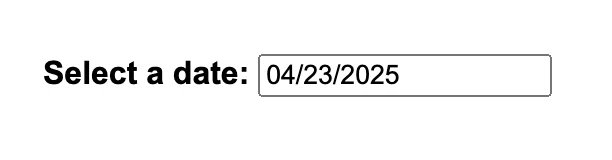
jQuery UI Datepicker Example
In your HTML file use the <script> tag to integrate the jQuery library in the document. You can also style the datepicker based on your preferences and type. Note: Make sure you integrate the jQuery index file in the head section or use the CDN link to integrate the element in your HTML document file.| <!DOCTYPE html> <html lang="en"> <head> <meta charset="UTF-8"> <title>jQuery UI Example - Datepicker</title> <!-- jQuery (required) --> <script src="https://code.jquery.com/jquery-3.6.0.min.js"></script> <!-- jQuery UI CSS --> <link rel="stylesheet" href="https://code.jquery.com/ui/1.13.2/themes/base/jquery-ui.css"> <!-- jQuery UI JS --> <script src="https://code.jquery.com/ui/1.13.2/jquery-ui.min.js"></script> <!-- Optional: Add some basic styling --> <style> body { font-family: Arial, sans-serif; padding: 30px; } label { font-weight: bold; } </style> </head> <body> <label for="datepicker">Select a date:</label> <input type="text" id="datepicker"> <script> // Initialize the datepicker $(function() { $("#datepicker").datepicker(); }); </script> </body> </html> |
Output
 |
How to Implement jQuery UI Themes?
The jQuery themes are predefined custom designed CSS styles which you can apply to your widgets integrated with the jQuery UI elements without writing the complete CSS code. jQuery uses a consistent class structure so themes can be applied in all web project elements.- Download a theme from the jQuery UI themeroller.
- You can choose a pre-built theme and create your own custom theme with the design you want.
- Click on download and you will get a zip file which you can integrate in your web project.
- Add the CSS file in your HTML head with a link spreadsheet.
- You can apply the them class using the class names like .ui-widget.
| <!DOCTYPE html> <html> <head> <title>Themed Datepicker</title> <link rel="stylesheet" href="https://code.jquery.com/ui/1.13.2/themes/smoothness/jquery-ui.css"> <script src="https://code.jquery.com/jquery-3.6.0.min.js"></script> <script src="https://code.jquery.com/ui/1.13.2/jquery-ui.min.js"></script> </head> <body class="ui-widget"> <h2>Pick a Date</h2> <input type="text" id="datepicker"> <script> $(function() { $("#datepicker").datepicker(); }); </script> </body> </html> |
Output
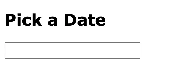 |
Master UI UX Design with PW Skills
Become a UI UX design expert and handle in demand project designs with PW Skills UI UX Design Course. With PW Skills UI UX Design Course, you can master the creation of interactive user interfaces and user experience designs. Learn UI UX design fundamentals, tools, and frameworks. Master Figma, Sketch, Adobe XD, Sketch, and other design tools in this 6 months course. Build a strong portfolio through hands-on projects and learn to craft appealing and interactive digital designs.


FAQs
Q1. What is jQuery UI?
Ans: jQuery UI is a Javascript library which is built over jQuery and provides a collection of pre-designed user interface (ui) components, widgets, effects, and more.
Q2. What is the use of jQuery UI features?
Ans: jQuery UI provides with pre-built features like widgets, themes, and other components to make your frontend design more attractive and intuitive.
Q3. What are the features of jQuery UI?
Ans: jQuery UI provides with easy to interact draggable and customizable components, effects, styles, themes and other design components to make your user interface better.
Q4. Is jQuery UI frontend or backend?
Ans: jQuery UI is an open source frontend library built on the top of jQuery a javascript library. You can use this to apply the built it components and effects in your user interface design.