
What is an Accordion in UI Design?
Accordions in UI Design is an effective design pattern that allows you to shrink your content space with collapsable elements on the web page. They are very helpful in reducing content clutter and offer a good user experience overall. In this article, let us learn more about Accordions UI Design.
 Varun Saharawat30 Oct, 2025
Accordions UI Design is an effective designing component where designers create hidden elements in a web page or application which requires a deeper understanding of user's needs and preferences for their interface representation. It has been one of the most popular and effective UI patterns for a long period of time.
In this article, let us learn how to implement Accordions in UI Design and the best themes and examples of accordions implemented on live platforms. We will also learn about the best practices of UI designers and more.
What are Accordions UI Design?
An Accordion is a UI Design pattern that is used to organize and toggle sections of content. It is very helpful in reducing clutter and improves user experience by allowing users to expand or collapse content on the application as per their needs.Accordions UI Design Key Takeaways
- Accordions UI Design is a pattern consisting of a vertically stacked list of components that can be collapsed and expanded based on the user's needs.
- Accordions are generally used in the FAQs section of a web page or application.
- Accordions UI Design can be triggered based on clicking or mouse hovering to collapse and expand at the point of user interaction with these elements.
- Designing Accordions requires a better understanding of user's needs and preferences.
Why are UI Designers Making More Use of Accordions?
Accordions have gained wider support and popularity as a UI Design pattern due to their ability to organize the content efficiently and improve the user experience. Some of the notable benefits of using Accordions ui design are mentioned below.Super Saving Design for Better User Experience
Using accordions can help you display large content in a structured way without overwhelming users and is ideal for all types of screens, such as mobiles, tablets, or desktops. For example, many e-commerce platforms use accordions to hide product descriptions, reviews, and other order details.Improve Readability and Focus
Accordions in UI Design hide the less important content which is often distracting and users can scan content quickly and expand the sections that they feel are needed. Your users will have to avoid long scrolling on the page, which will improve readability, engagement, and interaction rates on the platform.Enhances Interactivity
With effective Accordions implemented on a website page, it can encourage user interaction and engage more with control over what they can see in the first impression of the page. Smooth animations of accordions ui design create a more dynamic and responsive experience for the users.Organizes Complex Information
With accordions UI Design you can easily organize complex information with content distributed in multiple sections such as FAQs, forms, filters, and more. It helps designers group related items in a collapsible format or panels. For example, government and legal websites use accordions to structure policy information on their pages efficiently.Improves Website Load Time
With accordions ui design you can significantly increase your website loading time and pages load faster when contents are collapsed and loaded based on the needs and requirements. It helps with lazy loading, reducing unnecessary page rendering, and more. For example, good material design guidelines use accordions to load only necessary design details.Better Navigation with Accordions UI Design
Accordions UI Design offers good navigation where designers can make accordions keyboard friendly and screen reader accessible formats too. Using the ARIA attributes you can improve the UX for all users on your platform. For Example, Airbnb and Amazon use accessible accordions ui design in filters and product pages.When & Where to Use Accordions UI Design?
Accordions in UI Design can help you structure your content on the web page, provide you with toggle options, improve load time reduce clutter, and much more. However, there are places where you can use accordions in UI Design effectively. Let us check when and where we can use accordions ui design sufficiently.- You can use accordions on your web page when you have a long list of related content such as FAQs, filters, and more.
- It improves progressive disclosure to improve readability on your web page.
- When you need to save space on mobile screens and other devices.
- When you want to improve the user experience and readability of users on your platform.
- When you want users to quickly scan information on their own by using accordions.
- You can use accordions in reviews, product details, specifications, and more.
Best Practices for Accordions UI Design
Let us check some of the best practices that a designer must follow while implementing accordions in UI design.Keep Titles Clear & Short
Your accordion titles must be short and concise based on the type of interaction you want. Keep it descriptive and actionable and avoid promotion terms. Some of the popular headings are FAQs, product details, Reviews, Shipping & Returns, Customer Reviews, and more.Indicate Expand and Collapse Clearly
You can use icons like chevrons (⬆️ or ⬇️), ➕, or ➖ for expand and collapse actions on a web page to ensure visual feedback. You can also use icon rotation, color changes, or more to represent an accordion on a web page. In Google Material Design, you can clearly see a down chevron for accordions and an up chevron for expanded states.Auto Collapse And Stay Open
In auto collapse when you open another section of an accordion the other section you were viewing will close automatically while in stay open you can work with multiple sections open at a time or once. For example, in navigation menus, you can use auto collapse for better view and focus, while FAQs can contain multiple selections to stay open at a time.Add Smooth Animation for Better UX
You can easily use CSS transition i,e. 200-300 ms for a smooth closing and opening of an accordion in UX. This will avoid instant opening and closing which feels bad and gives an overall inefficient look of an accordion. Check a simple layout of CSS below for an accordion.| .accordion-content { max-height: 0; overflow: hidden; transition: max-height 0.3s ease-out; } .accordion-content.open { max-height: 500px; /* Adjust as needed */ } |
Keep it Keyboard and Screen Reader Accessible
You can use ARIA attributes such as aria expanded and aria-controls to ensure keyboard navigation can be accessed using the table and enter keys. Check a simple coded example of keyboard navigation in accordion ui design.| <button aria-expanded="false" aria-controls="section1">FAQ 1</button> <div id="section1" role="region">Answer to FAQ 1</div> |
Accordions UI Design Usage on PW Skills
You can easily check a live example of accordion usage on the web page of PW Skills blogs. We are using Accordions UI Design for our FAQs where all questions are displayed in an auto-collapse mode.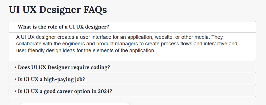 This is a live example of accordions UI Design on web pages of PW Skills.
Accordions UI Design Examples on Popular Pages
Let us look at the usage of accordions on other popular web pages on the internet.Apple FAQs Section with Accordion
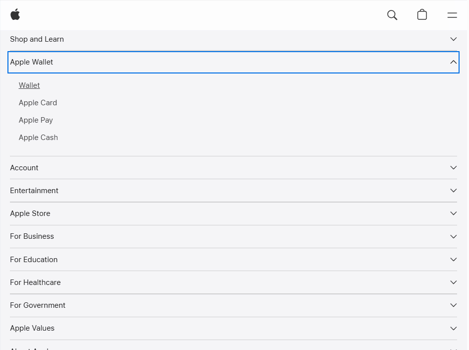 Apple uses a clean layout, bold typography, and clear separators with the help of accordions on their web page.
Modern UI Card Based Accordion
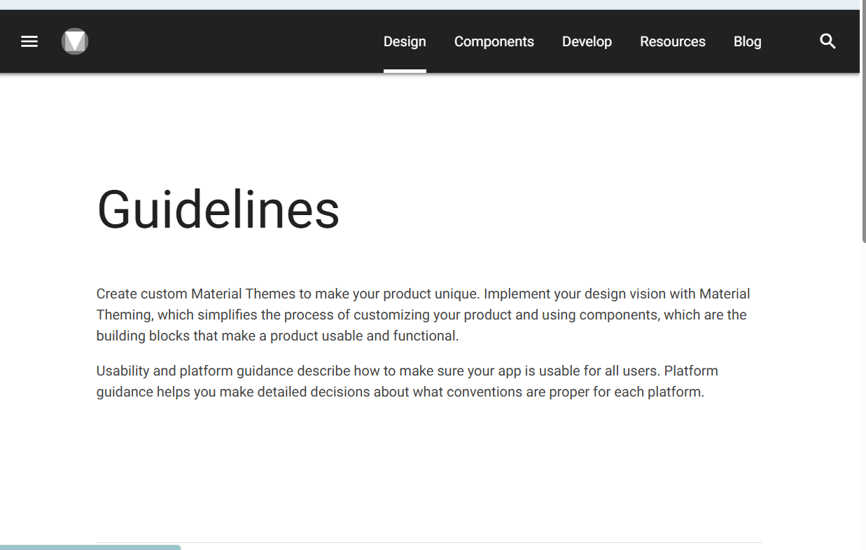 Modern UI platforms use accordions based on cards to separate items. Check the Google Material Design Guidelines section on the page.
Side Navigation Accordion on Figma, Notion, and Other Web Apps
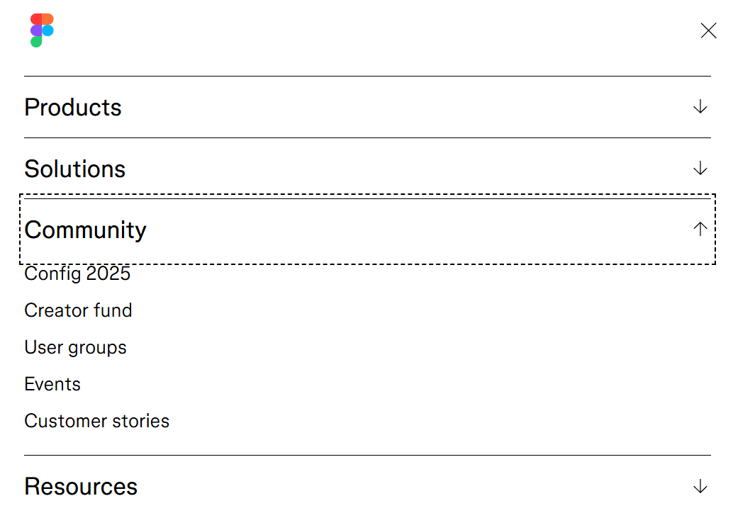 Many platforms are using collapsible sidebars with icons such as Notion, Slack UI, Figma, and more.
Learn UI UX Design with PW Skills
Become a design expert and handle in demand project designs with PW Skills UI UX Design Course. With PW Skills UI UX Design Course, you can master the creation of interactive user interfaces and user experience designs. Learn UI UX design fundamentals, tools, and frameworks. Master Figma, Sketch, Adobe XD, Sketch, and other design tools in this 6 months course. Build a strong portfolio through hands-on projects and learn to craft appealing and interactive digital designs. Learn from interactive live sessions, career assistance, and a dedicated peer network, and gain creative skills through user research, prototyping, and design tools.


Accordions UI Design FAQs
Q1. What are Accordions in UI Design?
Ans: An Accordion is a UI Design pattern that is used to organise and toggle sections of a content. It is very helpful in reducing clutter and improves user experience by allowing users to expand or collapse content on the application as per their needs.
Q2. Where do we use accordion?
Ans: Accordions UI Design is mostly used in web pages in FAQs, Product descriptions, reviews, and other sections of the web page.
Q3. What is the use of Accordion in web design?
Ans: Accordion in web design offers you a collapsible element which can improve your web page readability, loading time, user experience and readability. Users will be able to interact with your web application more easily with the help of accordions in web design.
Q4. What are auto-collapsible Accordions in UI designs?
Ans: In auto collapse when you open another section of an accordion, the other section you were viewing will close automatically, while in stay open you can work with multiple sections open at a time or once.