Mobile-First Indexing Explained
 Study Abroad27 May, 2026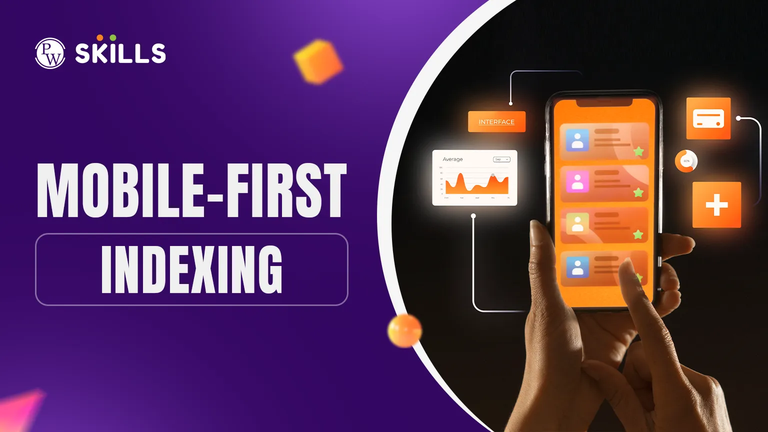
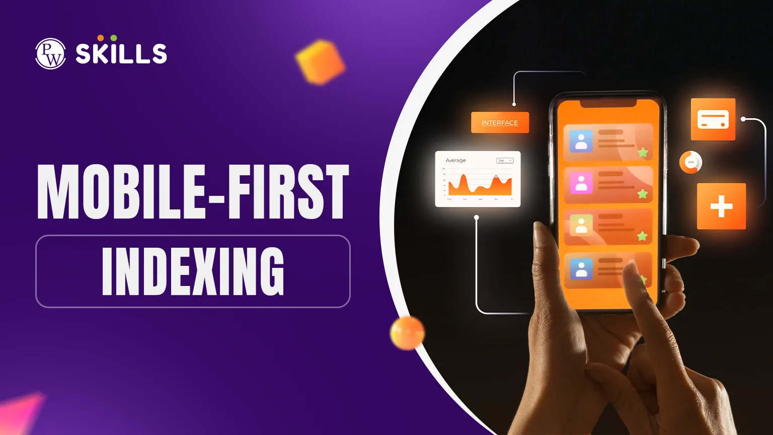
Most website owners focus heavily on how their site looks on a desktop, but this approach can hurt their rankings. If your mobile site lacks content or loads slowly, you may notice a significant drop in search visibility. This shift is due to Mobile-First Indexing, in which Google’s crawler focuses on the mobile version of your pages to determine your ranking.
Understanding this concept is essential for anyone looking to maintain a strong digital presence. This article breaks down how the process works and what you need to do to stay ahead.
What is Mobile-First Indexing?
In the past, Google mainly used the desktop version of a page's content to evaluate its relevance to a user's query. However, as smartphone usage skyrocketed, the search engine shifted its strategy. Mobile-First Indexing refers to the practice where Google predominantly uses the mobile version of the content for indexing and ranking purposes.
It is important to clarify that there is no separate "mobile-first index." Google continues to use a single index. The "mobile-first" part simply means that the Googlebot smartphone crawler is now the primary visitor to your site. If you have separate desktop and mobile URLs, Google will prefer the mobile URL for its database.
How Mobile-First Indexing Affects SEO
The move to a mobile-centric approach has changed the digital marketing landscape. Sites that are not mobile-friendly often see a decline in their search performance. Since Google looks at the mobile version first, any missing content, broken links, or slow loading times on your phone-optimised site will directly influence your desktop rankings as well.
Mobile first indexing in SEO impact includes:
-
Ranking Consistency: If your mobile site has less content than the desktop version, Google may not see the keywords you are trying to rank for.
-
User Experience (UX): Poor mobile UX can reduce user engagement and affect overall search performance.
-
Crawling Efficiency: A well-structured mobile site allows Google’s bots to find and index your pages much faster.
How to Start with Mobile-First Indexing
To navigate this shift, you must ensure your website's mobile and desktop versions are as identical in value as possible. While the layout may differ to fit smaller screens, the core information must remain consistent. Google recommends using responsive web design, where the same HTML code is served on the same URL regardless of the user's device.
|
Feature |
Desktop Version |
Mobile Version |
|
Content |
Full articles and media |
Must contain the same high-quality content |
|
Metadata |
Descriptive titles/tags |
Must be identical to the desktop version |
|
Structured Data |
Schema markup included |
Same Schema must be present |
|
Alt Text |
Descriptive text for images |
Mandatory for mobile accessibility |
Before diving into technical fixes, verify that Google can actually access your content. Use the URL Inspection Tool in Google Search Console to see how the smartphone bot views your pages.
Mobile-First Indexing Examples
Understanding how different site structures handle this indexing can help you choose the right path for your project. Here are three common mobile first indexing examples based on site architecture:
-
Responsive Design: The site uses the same URL and the same HTML. The layout changes based on the screen size. This is Google's preferred method.
-
Dynamic Serving: The URL remains the same, but the server sends different HTML/CSS depending on the device detected.
-
Separate URLs (m-dot): The site has a desktop version (example.com) and a mobile version (m.example.com). This requires "rel=canonical" and "rel=alternate" tags to help Google understand the relationship.
How to Optimise Mobile-First Indexing
Once the basics are covered, you can focus on mobile first indexing optimization to gain an edge over competitors. This involves fine-tuning the technical aspects of your site to ensure a seamless experience for both the user and the search engine.
Focus on the following technical areas:
-
Page Speed: Mobile users often have slower connections. Prioritise Core Web Vitals, specifically Largest Contentful Paint (LCP) and Cumulative Layout Shift (CLS).
-
Touch Elements: Ensure that all clickable elements, such as menus and buttons, are easy to tap with a thumb.
-
Lazy Loading: Use lazy loading for images to speed up initial page rendering, but ensure that content meant to be indexed is visible to the bot.
-
Video Optimisation: If you use videos, make sure they are easily viewable on mobile and don't slow down the page significantly.
Mobile-First Indexing Best Practices
Adopting a mobile-first mindset requires more than just making a site "fit" on a small screen. You need to ensure that the technical foundation is solid. Following these mobile first indexing best practices will help ensure your site remains competitive in search results.
-
Ensure Content Parity: High-quality text, videos, and images should be present on both versions of your site. Never hide content on mobile just to save space.
-
Check Data Formats: Ensure that your structured data (Schema) is present on the mobile version. Use supported formats like JSON-LD.
-
Optimise Visuals: Use high-resolution images, but ensure they are compressed for fast loading. Use supported formats like WebP.
-
Avoid Intrusive Pop-ups: Large interstitials that cover the whole screen on a mobile device can lead to a ranking penalty.
How to Check Your Mobile Indexing Status
Most websites have already been moved to Mobile-first Indexing, but you can confirm this for your own site quite easily. Log in to Google Search Console and navigate to the "Settings" menu. Under the "General" section, you will see a field labelled "Indexing crawler." If it says "Googlebot smartphone," your site has been transitioned.
If your site is still being crawled by the desktop bot, it might be because Google has detected significant issues with your mobile version. In such cases, review your mobile errors and fix them to trigger a re-evaluation. Consistency in content and technical health is the fastest way to earn the trust of the smartphone crawler.
Checklist for Mobile-First Indexing
To ensure your site is fully prepared, you should run a periodic audit. Use this mobile first indexing checklist to identify potential gaps in your strategy and fix them before they affect your traffic.
-
Mobile-Friendly Test: Use tools to verify if your buttons are too close together or if the text is too small to read.
-
Server Capacity: Ensure your servers can handle an increased crawl rate from the mobile Googlebot.
-
Metadata Consistency: Check that your H1 tags and Meta Descriptions match across all devices.
-
Robots.txt Verification: Make sure you aren't accidentally blocking the mobile bot from crawling important CSS or JS files.
-
Internal Linking: Ensure that links work correctly and point to the mobile version if you use separate URLs.





FAQs
Does mobile-first indexing mean Google only looks at mobile sites?
What happens if I don't have a mobile version of my site?
Is responsive design required for mobile-first indexing?
How do I know if my site is mobile-friendly?
Does page speed matter for mobile-first indexing?





Get Free Counselling Today
and Clear up all your Doubts
 Live & recorded classes available at easeDashboard for progress trackingLakhs of practice questions