What Is A Form In Bootstrap?
A form in Bootstrap is a way to collect user input on a website. Bootstrap is a popular tool that helps you design websites quickly and easily. With Bootstrap, you don’t need to create each part of a form from scratch. Instead, you use ready-made styles and classes to make your forms look good and work well.
For example, you can add the class “form-control” to an input field, and Bootstrap will style it nicely for you. This makes your form elements like text fields, checkboxes, and buttons look uniform and professional. Plus, Bootstrap ensures that your forms are responsive, meaning they will look great on both desktop and mobile devices.
Bootstrap forms also include helpful features like grouped inputs and custom checkboxes. These elements can improve the way your forms function and appear. Hence, using Bootstrap for forms saves your time and effort, allowing you to create attractive and easy-to-use forms without much hassle.
Form In Bootstrap – Key Takeaways
- Understanding what is Form In Bootstrap and its key features.
- Getting familiar with the advantages of using Forms in Bootstrap.
- Understanding the basic rules for creating a form using Bootstrap.
- Getting insights into different types of form layouts available in bootstrap.
Advantages Of Using Form In Bootstrap
Using Form in Bootstrap can significantly speed up your web development process while ensuring your site is modern, responsive, and visually appealing.
Bootstrap offers several advantages and benefits, some of the common advantages are listed below for your better understanding of the concept-
- Easy to Use- Forms in Bootstrap are straightforward to implement. With pre-designed classes, you can quickly create forms without having strong design skills.
- Responsive Design- Forms in Bootstrap automatically adjust to different screen sizes. Whether on a mobile phone or desktop, your forms will look great and function well.
- Consistent Appearance- Bootstrap ensures that all your form elements, like input fields and buttons, have a consistent look. This uniformity makes your forms look professional.
- Customizable- While Bootstrap provides a standard look, you can easily customize the forms to match your website’s style. You can add different colors, sizes, and layouts to fit your needs.
- Built-in Validation- Bootstrap offers simple classes for form validation, helping you ensure users enter the correct information. This feature improves the user experience by providing instant feedback.
- Time-Saving- Making Forms in Bootstrap saves time because you don’t have to start from scratch. The pre-designed elements and easy customization speed up the development process.
- Cross-Browser Compatibility- Forms created with Bootstrap work well across all major browsers. You don’t need to worry about how your form will look on different browsers; Bootstrap handles it for you.
Basic Rules For Creating Form Using Bootstrap
These are three standard rules for creating a form using Bootstrap, following these rules will help you in the easy creation of an Interactive form.
- Accessibility: Always use ‘<form role=”form”>’ to make your form accessible to people using screen readers.
- Optimal Spacing: Wrap all the labels and form controls in ‘<div class=”form-group”> to ensure proper spacing and alignment.
- Styling Inputs: Add the class ‘.form-control’ to all ‘<input>’, ‘<textarea>’, and ‘<select>’ elements to apply Bootstrap’s styling.
Layouts Of Forms In Bootstrap
Bootstrap offers various form layouts to help you create clean and responsive forms easily. Here’s a simple guide to understanding them:
Vertical Form Layout (Default)
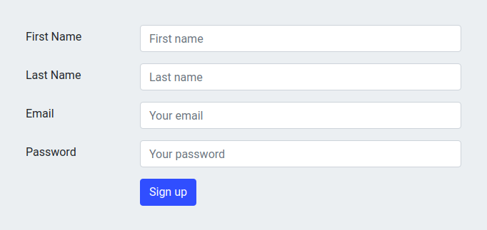
A Vertical form in Bootstrap includes text fields, checkboxes, and buttons. By default, these elements are stacked vertically, one on top of the other. This layout is straightforward and works well for simple forms.
Let us see a basic example of a code below, understanding how you can create a vertical form in Bootstrap.
| <!DOCTYPE html>
<html lang=”en”> <head> <meta charset=”UTF-8″> <meta name=”viewport” content=”width=device-width, initial-scale=1.0″> <title>Sign Up Form</title> </head> <body> <div class=”container mt-5″> <div class=”row justify-content-center”> <div class=”col-md-4″> <form> <div class=”form-group”> <label for=”firstName”>First Name</label> <input type=”text” class=”form-control” id=”firstName” placeholder=”First name”> </div> <div class=”form-group”> <label for=”lastName”>Last Name</label> <input type=”text” class=”form-control” id=”lastName” placeholder=”Last name”> </div> <div class=”form-group”> <label for=”email”>Email</label> <input type=”email” class=”form-control” id=”email” placeholder=”Your email”> </div> <div class=”form-group”> <label for=”password”>Password</label> <input type=”password” class=”form-control” id=”password” placeholder=”Your password”> </div> <button type=”submit” class=”btn btn-primary”>Sign up</button> </form> </div> </div> </div> <script src=”https://code.jquery.com/jquery-3.5.1.slim.min.js”></script> <script src=”https://cdn.jsdelivr.net/npm/@popperjs/core@2.9.2/dist/umd/popper.min.js”></script> </body> </html> |
Output-

Horizontal Form Layout
A horizontal form layout places labels and form fields side by side, making better use of horizontal space. This is especially useful for longer forms, as it reduces the overall length of the page. You can create this layout by using Bootstrap’s grid system and classes like form-horizontal and form-group.
| <!DOCTYPE html>
<html lang=”en”> <head> <meta charset=”UTF-8″> <meta name=”viewport” content=”width=device-width, initial-scale=1.0″> <title>Horizontal Form</title> <link href=”https://stackpath.bootstrapcdn.com/bootstrap/4.5.2/css/bootstrap.min.css” rel=”stylesheet”> </head> <body> <div class=”container mt-5″> <form> <div class=”form-row align-items-center”> <div class=”col-auto”> <label class=”sr-only” for=”firstName”>First Name</label> <input type=”text” class=”form-control mb-2″ id=”firstName” placeholder=”First name”> </div> <div class=”col-auto”> <label class=”sr-only” for=”lastName”>Last Name</label> <input type=”text” class=”form-control mb-2″ id=”lastName” placeholder=”Last name”> </div> <div class=”col-auto”> <label class=”sr-only” for=”email”>Email</label> <input type=”email” class=”form-control mb-2″ id=”email” placeholder=”Your email”> </div> <div class=”col-auto”> <label class=”sr-only” for=”password”>Password</label> <input type=”password” class=”form-control mb-2″ id=”password” placeholder=”Your password”> </div> <div class=”col-auto”> <button type=”submit” class=”btn btn-primary mb-2″>Sign up</button> </div> </div> </form> </div> <script src=”https://code.jquery.com/jquery-3.5.1.slim.min.js”></script> <script src=”https://cdn.jsdelivr.net/npm/@popperjs/core@2.9.2/dist/umd/popper.min.js”></script> <script src=”https://stackpath.bootstrapcdn.com/bootstrap/4.5.2/js/bootstrap.min.js”></script> </body> </html> |
Output-

Inline Form Layout
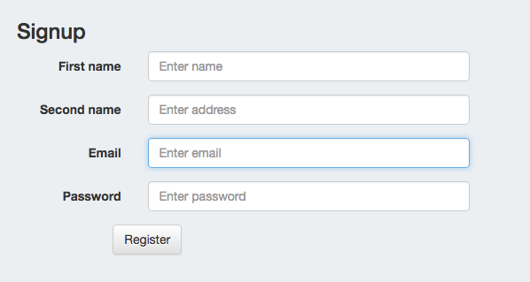
An inline form layout displays form elements in a single line. This is ideal for search bars or quick input forms where space is limited. Use the form-inline class to achieve this compact layout.
| <!DOCTYPE html>
<html lang=”en”> <head> <meta charset=”UTF-8″> <meta name=”viewport” content=”width=device-width, initial-scale=1.0″> <title>InLine Form</title> <link href=”https://stackpath.bootstrapcdn.com/bootstrap/4.5.2/css/bootstrap.min.css” rel=”stylesheet”> </head> <body> <div class=”container mt-5″> <h2>Signup</h2> <form class=”form-inline”> <div class=”form-group mb-2″> <label for=”name” class=”sr-only”>Name</label> <input type=”text” class=”form-control” id=”name” placeholder=”Enter name”> </div> <div class=”form-group mx-sm-3 mb-2″> <label for=”email” class=”sr-only”>Email</label> <input type=”email” class=”form-control” id=”email” placeholder=”Enter email”> </div> <div class=”form-group mb-2″> <label for=”password” class=”sr-only”>Password</label> <input type=”password” class=”form-control” id=”password” placeholder=”Enter password”> </div> <button type=”submit” class=”btn btn-primary mb-2″>Register</button> </form> </div> <script src=”https://code.jquery.com/jquery-3.5.1.slim.min.js”></script> <script src=”https://cdn.jsdelivr.net/npm/@popperjs/core@2.9.2/dist/umd/popper.min.js”></script> <script src=”https://stackpath.bootstrapcdn.com/bootstrap/4.5.2/js/bootstrap.min.js”></script> </body> </html> |
Output-

Learn Web Development With PW Skills
Join our Web Development Course and start your journey of becoming a web developer!
Whether you’re just starting out or looking to switch careers, our Comprehensive Full-stack development course is perfect for you. learning all the essential tools, including HTML, CSS, JavaScript, Express JS, Node JS, and more advanced technologies. Enjoy interactive classes, plenty of practice material, and regular doubt-clearing sessions.
Our experienced teachers are here to guide you on every step. Get the skills and knowledge you need to pursue your career in web development. Enroll now and start your journey today!
Form In Bootstrap FAQs
Why use form group in Bootstrap?
Using a ‘form-group’ in Bootstrap helps to structure and organize form elements by grouping related inputs and labels together. This ensures consistent spacing and alignment, making the form more readable and user-friendly. It also helps to apply Bootstrap's styling and layout features more effectively.
Which is the default form in Bootstrap?
The default form style in Bootstrap is the vertical form. This style stacks labels and inputs vertically without any additional classes required. The basic syntax and example of the vertical form are given above in the article for your reference.
What is Inline Form in Bootstrap?
In Bootstrap, Form Inline is a class used to create horizontal forms where form elements like inputs and buttons are displayed on the same line instead of stacking vertically. This layout is great for forms with shorter input fields and helps conserve space and present a cleaner look. The basic example of inline form is given above in the article for your reference.


