

Data Visualization - Definition, Examples And Advantages
Unlock the power of your data! Discover what data visualization is, see real-life examples, and learn how data visualization can make complex information easy to understand and use.
Before we explore data visualization, let's understand the concept of a data pipeline, as these two are closely connected. Think of a data pipeline as a virtual journey that your data takes, from its source to its destination. It's like a series of connected pipes, where each step is processing and transforming the data until it's ready to be visualized. So, let us dive more into the article and understand each term related to data visualization more clearly.
What Is Data Visualization?
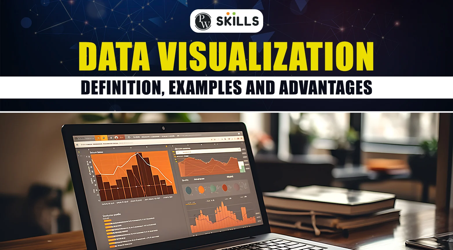
Data visualization is a way of showing information using pictures, charts, and graphs. Instead of maintaining complex tables and sheets for visualization, data visualization helps you see patterns and trends quickly. For example, a bar chart can show which months have the highest sales, or a line graph can display how product sales change over time. This makes it easier to understand complex information. Data visualization is like narrating a story with simplified pictures, making it simple for everyone to see what's happening and why it matters. It's used in many fields, from business to science, to help people make better decisions by understanding data more clearly.Why Is Data Visualization Important?
After understanding what Data visualization is, let us understand its importance in simple terms- Imagine you are tracking the sales of different products in a store over the past year. You create a bar chart where each bar represent a different product, and the height of each bar shows the total sales for that product. By looking at the chart, you can quickly see which products are selling the most and which ones are lagging behind. For example, if the bar for Product A is much taller than the bars for Products B and C, it’s clear that Product A is the best-seller. This visual comparison is much quicker and easier than trying to figure out the top-selling product by reading through rows of sales numbers in a table. This example shows how data visualization helps in identifying trends and making decisions swiftly. Let us see some more examples, showcasing the importance of Data visualization.1. Data Visualization Discovers Data Trends
Data visualization helps uncover trends and patterns that might not be obvious in raw data. For instance, a line chart showing monthly sales over several years can quickly reveal whether sales are increasing, decreasing, or remaining stable. It makes it easier to spot seasonal fluctuations, sudden spikes, or consistent growth. By identifying these trends, businesses can make informed decisions, such as planning for peak seasons or addressing potential downturns early. Visualization transforms complex data sets into clear, actionable insights, enabling better strategic planning and performance tracking.2. Data Visualization Provides A Better Data Perspective
Visualizing data offers a broader perspective, making comparing and contrasting different data points easier. For example, a pie chart can illustrate the market share of different companies within an industry, allowing you to see clearly who the major players are. It highlights relationships and proportions that are mainly difficult to analyze in a spreadsheet of numbers. This perspective helps in understanding the importance of different data sets, which offers more balanced and comprehensive analyses, that is crucial for effective decision-making.3. Data Visualization Puts Data Into Correct Context
Context is crucial for understanding data, and visualization provides that context effectively. For example, a map showing regional sales figures places data in a geographical context, helping to identify regional performance variations. By putting data into context, visualizations help explain why certain trends occur, making the information more meaningful and actionable.4. Data Visualization Saves Time
Interpreting raw data can be time-consuming and confusing. Data visualization simplifies complex data sets, allowing users to understand large amounts of complex information quickly. For example, a dashboard displaying key performance indicators (KPIs) like sales, profits, and customer engagement in various charts and graphs provides an instant overview of business health. This quick access to vital information reduces the time spent on data analysis, freeing up time for decision-making and strategy development.5. Data Visualization Makes Data Narrative
Data visualization transforms numbers and complex data into a narrative manner, making data more engaging and easier to understand. For example, info about a company's growth journey, using charts, images, and minimal text, can effectively communicate how the company has evolved over the years. It highlights key milestones, achievements, and much more in a visually appealing format. By making data narrative, data visualization not only informs but also engages the audience, making complex data relatable and memorable. It helps convey the significance of the data in a compelling and impactful way.Advantages Of Using Data Visualization
Using Data visualization in your business and day-to-day life has several advantages, let us see some of the most common advantages which make Data visualization a great tool for understanding data insights.- Simplifies Complex Data
- Enhances Data Analysis
- Improves Communication
- Better Decision-Making
- Identifies Relationships and Correlations
- Supports Strategic Planning
- Increases Engagement
Disadvantages Of Data Visualization
As every coin has two sides, data visualization also has some disadvantages which makes it a vulnerable tool to use, some of those disadvantages are written below for your better understanding-- Inaccurate Information
- Losing Important Core Messages
- Technical Limitations
- High Costs
Tools Used In Data Visualization
There are various data visualization tools available in the market providing different features from one another. Below is the list of top 10 tools that will surely enhance your data, making it easy to interpret and analyze.| Data Visualization Tools |
| 1. Tableau |
| 2. Looker |
| 3. Zoho Analytics |
| 4. Sisense |
| 5. IBM Cognos Analytics |
| 6. Qlik Sense |
| 7. Microsoft Power BI |
| 8. Klipfolio |
| 9. Domo |
| 10. SAP Analytics Cloud |
Top Data Visualization Libraries
There are various libraries available in Python and R to easily visualize data, each offering a range of tools and functionalities to suit different needs. We have made a table below representing the libraries and their functionalities for your better understanding of the concept.| Data Visualization Libraries In Python | |
| Libraries | Features |
| 1. Matplotlib | One of the most widely used libraries for creating static, animated, and interactive visualizations. |
| 2. Seaborn | Seaborn provides a high-level interface for creating attractive and informative statistical graphics. |
| 3. Plotly | Plotly allows users to create dynamic graphs and dashboards that can be embedded in web applications. |
| 4. Bokeh | Bokeh is particularly well-suited for creating web-based dashboards and applications. |
| Data Visualization Libraries In R | |
| Libraries | Features |
| 1. ggplot2 | ggplot2 is known for its ability to create complex and multi-layered graphics using a consistent and intuitive grammar of graphics. |
| 2. Plotly For R | Plotly for R offers tools for creating interactive, web-based plots that can be easily shared and embedded. |
| 3. Lattice | Lattice is ideal for producing multi-panel plots that show data distributions and relationships. |
| 4. Shiny | It can integrate with various R visualization packages to create dynamic, user-friendly interfaces |
Learn Data Science With PW Skills
Ready to explore the exciting world of data science and generative AI? Join PW Skill's Data Science with Generative AI course for an incredible learning experience! Get mentored by industry experts who'll guide you every step of the way. Our course includes regular doubt sessions, daily practice sheets, and support from a vast PW Skill alumni network. Plus, we promise 100% job assistance, helping you kickstart your career with confidence. So what are you waiting for? Enroll now and discover the future of data science with us!


🔥 Trending Blogs
Data Visualization FAQs
Why is data visualization important?
Data visualization is important because it transforms complex data sets into visual formats that are easier to understand and grasp. It allows for quicker data analysis, helps in identifying trends and patterns, and makes data more accessible to a broader audience.
What tools are used for data visualization?
Popular tools for data visualization include:
Python libraries: Matplotlib, Seaborn, Plotly, Bokeh, Pandas.
R libraries: ggplot2, Shiny, Plotly for R, Lattice, highcharter
Other Data Visualization tools: Tableau, Microsoft Power BI, Google Data Studio and much more.
What are best practices for creating effective data visualizations?
Effective data visualizations can be created by following these below written practices:
1. Match the visualization type to the nature of your data and the message you want to convey.
2. Focus on clear, concise visuals.
3. Ensure axes and scales accurately represent the data without distortion.
4. Use descriptive titles, labels, and legends to make the visualization easy to understand.
5. Use consistent colors, fonts, and styles to avoid confusion.