Gestalt principles are based on the way the human brain works by grouping similar elements, simplifying complex images, and recognizing patterns for a better user experience and layout.
Designers make use of this principle to organise content on websites and make it easy to interpret and understand. Our mind can recognise patterns, fill in incomplete elements to form a complete image, group close elements together, take similar shapes as one, and more. Here, we will learn how to take care of the Gestalt principles while designing our applications or websites.
The Concept Behind the Gestalt Principle
The Gestalt Principle is based on how the human brain naturally recognises the visual information on the screen. Our mind is smart, and it can automatically group, connect, and interpret visual elements to form meaningful patterns and recognise elements on the screen.
- The Gestalt principle originated from the Gestalt psychology founded in the early 1990s by German Psychologists Max Wertheimer, Kurt Koffka, and Wolfgang Kohler.
- The human brain looks for patterns connecting different elements to create a meaningful object.
- This concept of organizing visual information and other stimuli into patterns marks the foundation of the Gestalt principle.
- Gestalt principles help us create structured and meaningful content that improves the user experience and is easy to understand for viewers.

For example, have you seen the WWF panda? Your brain completes the missing shapes to recognise a full panda even though the image is not complete. The image is formed using incomplete black shapes. But our mind does the work and fills the gaps, allowing us to perceive a complete figure.
Read More: How to Become a UI UX Designer? Step-by-Step Process
Why Do Gestalt Principles Matter?
The concept of the Gestalt principle is used by designers to increase engagement and gain a positive user experience on their platform. A properly organised visual hierarchy is easy for the brain to understand does the work.
| “The whole is greater than the sum of its parts.” – Kurt Koffka |
- The human brain seeks patterns
- Our brain tries to simplify complex images
- We are capable of connecting real shapes
- Our brain fills incomplete spaces to form complete objects.
Let us check on some of the reasons that make the Gestalt Principle important to consider.
1. They Improve Visual Clarity
Gestalt principles guide designers, mainly UI UX Designers, graphic designers, and much of the importance of organizing elements so that users can quickly understand what they are looking at.
The use of grouping, alignment, and spacing reduces confusion and improves readability for the application as well as the web page.
2. They Guide User Attention
Designers can use principles like similarity, continuity, and closure to direct a user’s focus to the most important parts of a page or image.
3. They Make Designs Feel Natural and Intuitive
As these principles reflect how people naturally perceive things in various places, considering them as elements creates interfaces and visuals that feel smooth and easy to navigate.
4. They Enhance User Engagement
It is often observed that users stay longer on designs that are visually appealing, balanced, and easy to understand. Gestalt principles main purpose or objective is to avoid clutter and improve the overall experience.
5. They Strengthen Brand Perception
Various logos like WWF, FedEx, and IBM use Gestalt principles to generate a visually appealing element for their platform.
6. They Help Communicate Information Faster
When the structure of content is properly oriented, it lets users grasp meaning easily at a glance, which is important in dashboards, apps, websites, and marketing materials.
The Gestalt Principles Explained
You can create a visually appealing design with the ability to deliver a positive user experience. Check these principles of the Gestalt Principle below.
1. Proximity
The proximity element in Gestalt principles represents the relationship between elements that are in the vicinity of each other. Objects that are placed close to each other are considered to be from one group.
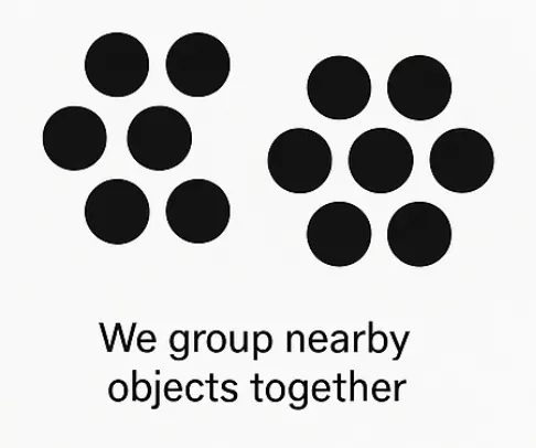
In reality, the concept of proximity helps us simplify complex visuals by helping us understand clusters, categories, classifications, and more. With proper use of proximity, you can easily improve your platform’s readability and better organisation.

You can see that the proximity principle is being used to communicate that the images in these blocks somehow relate to one another.
Read More: 5 Free UI UX Design Courses With Certificate: Are Free Courses Worth It?
2. Similarity
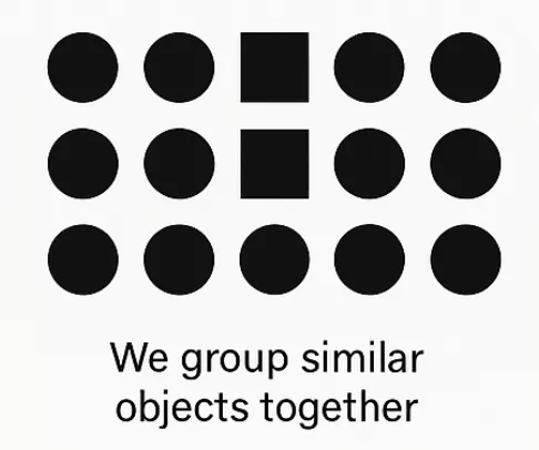
Whenever the visual elements are the same in shape, size, or color metrics, users often group them together. Our brain relates like with like, which helps us quickly make sense of visual layouts without having to analyze each item individually.
In this example, our brain interprets both squares in the image as a single, grouped element.
3. Continuity
This principle explains how human eyes give more preference to continuous paths or lines, rather than broken ones. Our human brain naturally follows a straight line, curve, or other continuous shape.
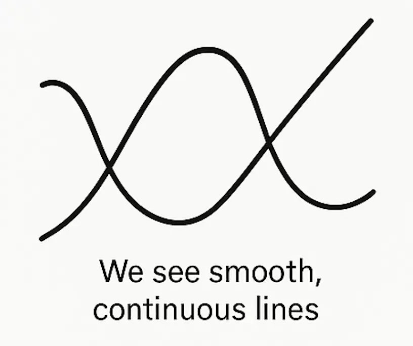
These smooth, curved lines cross each other, but our mind prefers flowing lines over abrupt changes where the line crosses each other multiple times. This is one of the key Gestalt principles used to attract the attention of users using smooth visual transitions and illustrating different kinds of movements.
4. Figure Ground
This principle in design is used to explain how we interpret figures in both the background and foreground. It depicts how we can distinguish an object that’s kept in front and ground. With proper visual elements, our brain understands what we are searching for.

Let us take the example of the classic faces vase illusion, where you might see two faces looking at each other or a vase, depending on how your brain interprets the shapes. The foreground and background in this image keep changing.
Designers make use of this feature to highlight important elements, grab attention, and more.
5. Symmetry
It states that the human mind perceives objects as balanced and orderly when their elements are arranged symmetrically. When our mind catches symmetrical elements, it groups them together and interprets them as a single entity. This is because symmetry feels more appealing.
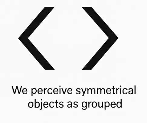
When our brain sees this, it groups these two symmetrical objects together. It can be used to grab the attention of users to an element or event, etc.
6. Emergence
Our brain sometimes brings together irregular or complex shapes to perceive a whole image rather than focusing on its individual parts. Our mind generally picks up the overall form first, rather than noticing the smaller components that make up the image.
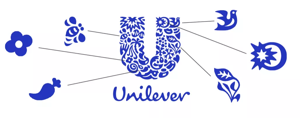
Here in this logo of universal we instantly recognise the big shape i,e. U instead of going into details of what this is made of and what individual patterns are making it possible.
Read More: 5 Free UI UX Design Courses With Certificate: Are Free Courses Worth It?
7. Closure
Our mind automatically fills the gaps using the elements that are arranged in a vicinity or closer to each other, giving a perception of the complete image. This increases users’ engagement by using incomplete or cleverly placed line elements, dots, or shapes to make up the complete image.

Here, in this example, you might be seeing three Pac-Man-like shapes making a triangular arrangement. Even when the triangle you see on the screen is not complete, your mind instantly fills the gap and perceives the full triangle in the center.

Now, each of these courses here in the image below belongs to the software development category, and they are placed together in close together giving us a perception of the complete rectangle enclosing each of these courses together.
8. Common Region
The common region principle in UI UX states that objects placed inside the same boundary are perceived to belong together. When a group of elements differing in size, shape, color, or other properties is placed together, they are often taken as a single group or related.
The best example is a UI Card you see on websites. Check here these UI card elements enclose courses.

Gestalt Principles FAQs
Q1. What are Gestalt Principles?
Ans: Gestalt principles in design are based on laws of human perception that depict how humans group similar elements in close proximity or symmetry as a single entity, recognize patterns, and simplify complex designs into visually appealing and positive user experiences.
Q2. What are the five principles of Gestalt?
Ans: Proximity, similarity, continuity, closure, and connectedness are five examples of Gestalt principles.
Q3. Why is Gestalt important?
Ans: The Gestalt Principle highlights the importance of visual clarity, grabs user attention, and gains a positive user experience with visually appealing designs.
Q4. Where to use Gestalt Principles?
Ans: Gestalt principles inspired from how human mind perceives visual elements and used in fields like UI/UX Design, graphic design, visual communications, websites, mobile applications, dashboards, posters, and more.

