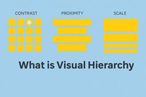
Visual hierarchy is a principle of design that allows you to guide a user’s eyes in the order that you want them to follow. Think of it as telling a story: instead of words, you tell it with size, color, spacing, and contrast-a well-structured visual hierarchy makes the important element noticed first, then the next one, and so on.
In a nutshell, visual hierarchy deals primarily with structuring information clearly and intuitively. Be it designing an app, a website, or even a poster, understanding visual hierarchy in design would either make or break user engagement.

The Psychology Behind Visual Hierarchy in Design
Accept it or not, humans see before they process everything else in their surroundings. They don’t really read websites from left to right as books. Our reading is mostly associated with the scanning and looking out for patterns. This is visual hierarchy in the making.
Visual Hierarchy is where designers add compulsion virtues’ features for nudging user behavior, such as clicking a button or reading a headline. Most have some foundation in psychology-describing the way humans view screens, F-pattern or Z-pattern scanning, for example.
Mastering visual hierarchy means more than making a page beautiful. It helps users to make decisions quickly and reduces cognitive load.
Elements That Shape Visual Hierarchy
Here is how you can induce a strong visual hierarchy in design using just a few easy but powerful elements:
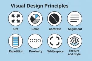
- Size & Scale- Bigger objects are noticed first.
- Color & Contrast- Bright or high-contrast colors to catch the eye.
- Typography- Weight of font applied through family and space.
- Spacing & Alignment- Get together related items.
- Repetition & Rhythm- Consistency, thus, is rationally maintaining the hierarchy.
Each plays a role in constructing a visual pathway. The trick would be to use them wisely to achieve the visual hierarchy along the lines of your content goals.
Example of Visual Hierarchy: A simple login page
Let’s take a visual hierarchy example most of us come across: a login screen.
- The Login headline- Bold, larger-grabs first attention.
- The email password fields come afterward-medium size-clear labels.
- The Login button is bright and has enough space-it calls for action.
- A “Forgot Password?” link is smaller and lighter-optional interaction.
This visual hierarchy example shows that even simple screens can help maneuver users smoothly as long as they are designed well.
Common Mistakes in Visual Hierarchy
It is never smooth sailing when establishing a visual hierarchy in design. Just a couple of common mistakes include:
- Too many focal points: Don’t confuse users with clutter.
- Lack of contrast: If everything is bold, nothing stands out.
- Poor alignment: Messy layouts break visual flow.
- Ignoring mobile responsiveness: Visual hierarchy should adapt to screen size.
To fix these, always start with intent – what do you want users to notice first? Build from there.
![]() Join Our UI/UX Telegram Channel
Join Our UI/UX Telegram Channel
![]() Join Our UI/UX WhatsApp Channel
Join Our UI/UX WhatsApp Channel
Visual Hierarchy in Design: Best Practices for Web and App Interfaces
To create a UI that is intuitive, keep these best practices in mind when building a strong visual hierarchy in design:
- One Primary Action per Page: Clearly accentuate the most significant task.
- Use White Space Richly: This gives breathing space and boosts clarity.
- Typography Pyramid: Use H1, H2, body text consistently.
- Page Turn-friendly Structure: In using visuals, help guide users down the page.
These subtle changes can elevate your design from “okay” to “awesome” using just the power of visual hierarchy.
Why Visual Hierarchy is Important in Branding
In branding and digital marketing, visual hierarchy does more than lead the way; it establishes trust and identity.
With strong visual hierarchy in design, brands let the user know the important messages they would like to convey, calls to action, and promotions within their context without overwhelming the user. Banner, landing page, and product card examples. What immediately catches the eye? Indeed so; it’s visual hierarchy at work.
Both Apple and Nike molded their interface with such beauty, not really to impress but to convert customers well.

What Is the Importance of Visual Hierarchy in Accessibility?
This aspect is something that has always been overlooked: that visual hierarchy is for everybody, especially the users with cognitive and visual disabilities.
Clear visual hierarchy enhances screen readers and ease of reading the text, and users can never miss important information. Beyond “just making things look nice,” this is inclusive design.
Thus, if you’re designing for real people-not for your portfolio vision alone-then visual hierarchy becomes a non-negotiable skill.
Also Read:
- Design Psychology: Top Design Psychology Principles Every Designer Must Know
- What Is a User Flow? Why Is It Important In UX design?
- Master Design Thinking: 5 Phases to Solve Problems Effectively
- Design Sprint Explained: The 5-Day Shortcut to Innovation
Master UI/UX with PW Skills
Want to learn the art of beautiful and intuitive designs? The UI UX course offered by PW Skills is meant for such learners who want to have a real-world experience rather than theory. Learn how to design like a pro with hands-on tools and mentorship from the best industry experts.
Absolutely. Even presentation slides or social media posts benefit from good visual hierarchy, which is all about developing clear communication. Layout is the structure; visual hierarchy is the storytelling within it. They complement each other because hierarchy adds meaning and flow. Yes! Mobile screens call for sharper visual hierarchy since the space is smaller. It gives rise to even more necessity for prioritizing the content.Visual Hierarchy FAQs
Can I use visual hierarchy even if I'm not a professional designer?
How does visual hierarchy differ from layout?
Is visual hierarchy essential in a mobile-first design?

