We all have come across many UI elements while navigating on our mobile phones and laptops, but ever wondered what roles does these ui elements play in a designers roles and users experiences? Well, we are here to discuss an overall effect of UI elements on the working of every designer.
In this article, we are about to discuss the role of UI elements, their types and frequently used UI elements in 2025 with popular examples of each.
What are UI Elements?
UI Elements are building blocks of a user interface of a digital product, such as web application, website, software, etc. These elements are designed to facilitate UI designers in creating a user friendly interface in more effective ways. They are the most integral part of a software application for every device type such as mobile, desktop, AR/VR application and mobile apps.
UI Elements: Key Takeaways
- UI elements are the visible interactive part of an application where users can navigate and perform tasks on their application.
- These elements form the foundation of a user interface and provide a seamless way for users to navigate and receive feedback.
- Some of the popular UI elements are buttons, dropdowns, progress bars, checkboxes, navigation menus, tooltips, and more.
- There are many types of UI elements such as input elements, informational elements, navigational elements, and interactive elements.
Types of UI Elements In 2025
User elements contain everything from buttons, menus and icons. These elements add to interactive and navigation to the application making it more friendly and help users to interact with the applications. These UI elements enhance the user experience making it easier for users to complete tasks without any hassle.
Input Elements
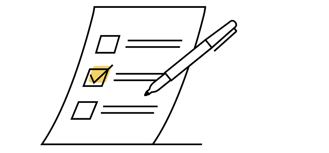
These Input elements in UI offers a way for users to feed their input and provide data or trigger an action on the page. These UI elements provide a path between users and software to interact with each other. Users can modify data and input any information they want to provide to the server or on the other side.
| UI Elements | Description |
| Text Fields | For entering text (e.g., search bars, login fields). |
| Checkboxes | Allow multiple selections from a list. |
| Radio Buttons | Let users choose one option from a group. |
| Dropdowns (Select Menus) | Display multiple options in a compact way. |
| Sliders | Adjust values within a range (e.g., volume control). |
| Toggles (Switches) | Enable/disable a setting (e.g., dark mode switch). |
| Date & Time Pickers | Allow users to select a date/time. |
| File Upload | Lets users upload files (e.g., images, PDFs). |
Navigational UI elements

These UI elements provide a way for users to navigate through a website or application by taking them through different options available on the platform. They play an important role in executing actions by users such as adjustments, sliders, menus, and more. These elements include tabs, breadcrumbs, links, buttons, and more. With navigation menus showing your way through the application, buttons helping you execute an action and more.
| UI Elements | Description |
| Navigation Bar | Contains links for primary sections of an app/site. |
| Breadcrumbs | Show user’s location within a hierarchy (e.g., Home > Products > Laptops). |
| Sidebar | Vertical menu for secondary navigation. |
| Pagination | Breaks content into multiple pages. |
| Tabs | Organize content in separate sections (like browser tabs). |
| Search Bar | Allows users to find content easily. |
Informational UI elements

These UI elements provide a method to provide alerts, messages, content, and more. These elements help users in implementing effective navigation and improving user comprehension. It includes various components such as icons, labels, graphics, error messages and more which can help users experience while iterating the application.
| UI Elements | Description |
| Tooltips | Small pop-ups that provide extra information on hover. |
| Progress Bars | Show task completion (e.g., file uploads). |
| Notifications | Alerts users about updates or messages. |
| Modals/Pop-ups | Overlay windows for actions (e.g., login prompts). |
| Badges | Small indicators for status updates (e.g., unread messages). |
| Snackbar/Toast Messages | Temporary feedback alerts (e.g., “Message Sent”). |
Input UI Elements
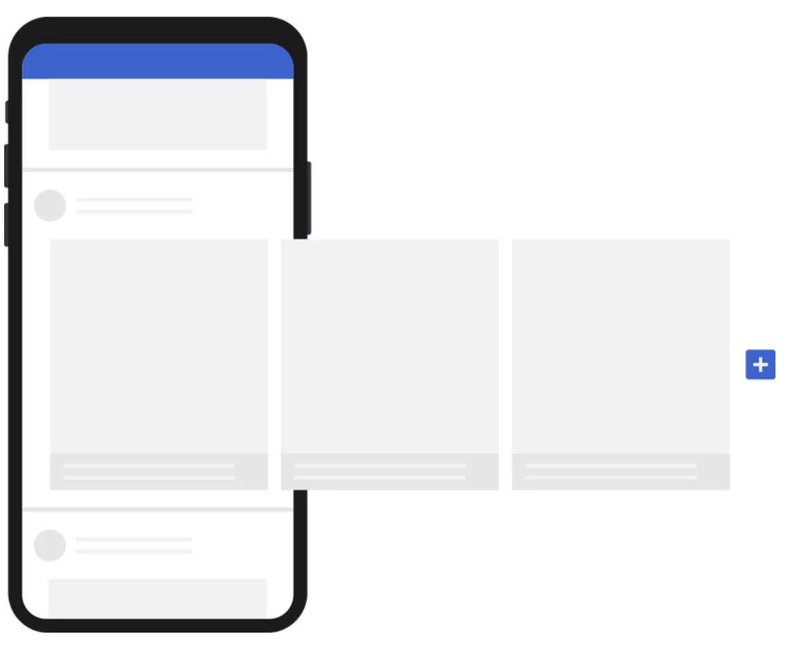
These input UI elements are used to define the structures and grouping of content. Users can easily provide information in these UI elements and get the information to the backend of the server or application.
These elements in the user interfaces are used to provide data and information to the application and interact with the systems easily. It comprises of a long list of input control elements such as checkboxes text fields, dropdowns, sliders and more
| UI Elements | Description |
| Cards | Compact UI blocks used for displaying grouped information. |
| Accordions | Expand/collapse sections (useful for FAQs). |
| Carousels | Image sliders for multiple content pieces. |
| Grids & Lists | Arrange content in structured formats. |
Actionable Components (Buttons, Links)
These components like buttons, hyperlinks, anchor elements, icons can be clickable and provide you with specific actions on your application. Clicking these elements can take you to a new page or other website of the application and help you navigate to multiple locations inside the application.
| UI Elements | Description |
| Buttons | Triggers actions (e.g., Submit, Buy Now). |
| Floating Action Button (FAB) | A primary button that stands out (e.g., “+” in Google Keep). |
| Hyperlinks | Clickable text for navigation. |
| Icons | Small visual symbols for quick actions (e.g., heart, share). |
Advanced UI Elements for New Age Technology in 2025
These UI elements consist of the advanced artificial intelligence technologies and machine learning algorithms which can provide users with complete uninterrupted guidance and discoveries on a platform. These technologies are making applications more productive and effective based on speech recognition, gesture controls, dark mode toggles, AI chatbots and more.
With artificial intelligence applications can easily provide response to a variety of inputs given by users and guide them throughout the application within no time. The gesture controls, personalization and other features offered by the UI elements are doing wonders in digital products nowadays. Some popular advanced UI elements in 2025 are listed below in the table.
| UI Elements | Description |
| Chatbots | AI-driven conversational UI. |
| Voice UI Elements | Microphones for voice input. |
| Gesture Controls | Swipe, pinch, and tap interactions. |
| Dark Mode Toggles | Switch between light/dark themes. |
Different UI Elements Used In the User Interfaces of Digital Products
UI elements are used for increasing accessibility, aesthetics, and usability of an application. Let us now have a look around some of the different UI elements used in the interfaces nowadays or for a long time.
Checkboxes
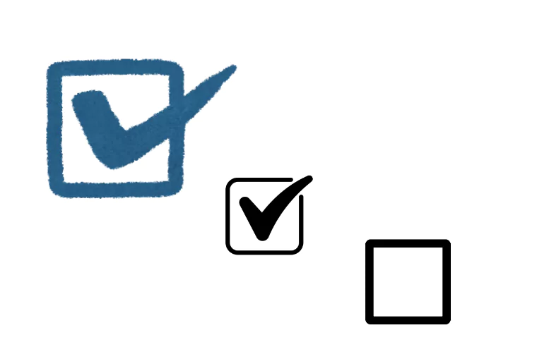
The checkboxes are used to provide users with the ease to select multiple options available in a field. With a square type of boxes which can be filled with a click and the option is selected on the backend. They are popularly used to accept terms and conditions or for multiple selected options. You can also use checkboxes for providing a single selection.
Sliders or Slidebars
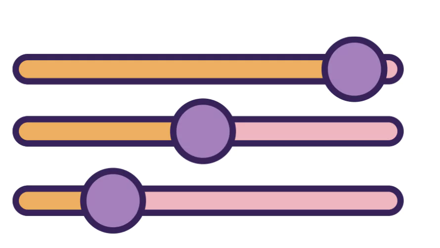
These user interface elements are used to provide users with the ease to select a value given within a range and is popularly used in implementing volume controls, price filters, shorting, and more especially in ecommerce platforms or navigational platforms. You can use these sliders to zoom in and zoom out and perform plenty of tasks lying between a range of numbers.
Breadcrumbs

These user interface elements are used to show the user’s location within the hierarchy of an application. These are navigational features on a website which help users provide a way to navigate back to previous pages on the application. They are present on top of a web page by default or on the navigation bar.
Buttons
These elements are used to provide actionable clicks for users. They are interactive elements which guide users through application functions. Buttons are widely used on an interface with labels and distinctive figures. Buttons are used to perform an action, submit forms, move to the next page and make a choice.
Buttons must be used wisely on a user interface platform with choices. It also provides users with choices and provides balance and avoids excessive clutter for seamless user experience.
Accordion

Accordions are used as a collapsible menu or section on a content page. They are used by materials to allow them to include large amounts of information within a limited space. Accordions in UI Design can include multiple contents within it which can expand and contract when needed. Accordions are used by many popular websites like Apple, Microsoft, PW Skills and other organisations.
Card
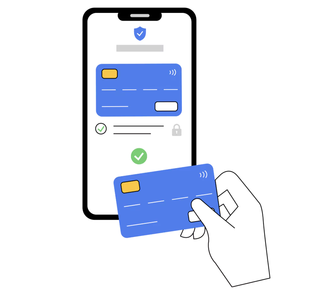
Card is an important UI element which is generally of a square, rectangle or circular space that contains different kinds of information in the form of text, media, videos and so on within a defined space. Users can enter information, display content and also choose between different types of card options available for designers.
Carousel

Carousels are a slider representation of elements in cards or photos which can be moved right or left through the page using a single button or clickable element. Carousels make the page interactive and appealing where you can display contents, images, cards or more information. You can represent the carousel in a different format which will allow you to represent more than one information in a structured format.
Dropdown
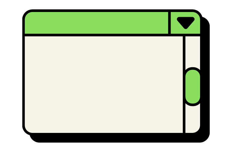
Dropdowns are UI elements which allow users to select an item from a list of options available in the drop down menu. You can learn more about these dropdown elements when you click on an arrow button to open it and you can see a list of options listed on your user interface.
Feed
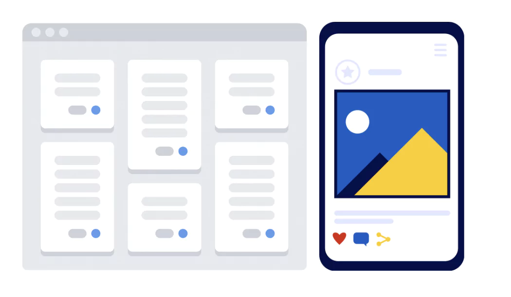
Feeds are the space where posts or content are listed in an application; it is a place where user activity is displayed or results of actions are displayed in a particular order which can be set based on your preference or users. You can drop various contents on feed.
UI Forms

UI Forms can be used to provide information of a user on the platform and submit them to the server end. These boxes can be used to provide credit card information, rentals, personal data, contact details, emails and more.
Icons
Icons are images used as a banner to communicate the functionality of applications to the users. They can help users find the application or software they are looking for. Icons are generally self-explainable which can be used for settings, time, dots, plus and even icons with pictures are popular nowadays.
Loader

Loaders are attractive elements presented to the users when their pages are loading before they can click for some action. You can use predefined themes, default themes or design a custom loader theme for your website to make your interface more appealing and attractive.
Notification Elements

The notification elements are presented on the screen on interfaces to present you with alerts or something you need to shift your attention to, which can be messages, new alerts, checkout messages, and more. Notification is not only used to alert you with things that are important but also update you with any unknown error caused in the application.
Progress Bar

Progress bars are horizontal straps of slider elements or some different shapes which can be used to represent the completion status of a task, project, and more. It can be used in checkouts form, billing and shipping while finalising a purchase or completing a course material.
Slider Controls

These controls are present in UI elements and can greatly help users in selecting a value within a range and filter contents based on the filter options. Users can easily drag the slider with fingers or mouse and adjust brightness, volumes, price range or more while different activities.
Learn UI UX Design With PW Skills
Become a design expert and handle in demand project designs with PW Skills UI UX Design Course. With PW Skills UI UX Design Course, you can master the creation of interactive user interfaces and user experience designs.
Learn UI UX design fundamentals, tools, and frameworks. Master Figma, Sketch, Adobe XD, Sketch, and other design tools in this 6 months course. Build a strong portfolio through hands-on projects and learn to craft appealing and interactive digital designs. Learn from interactive live sessions, career assistance, and a dedicated peer network, and gain creative skills through user research, prototyping, and design tools.
UI Elements FAQs
Q1. What are UI elements?
Ans: UI Elements are building blocks of a user interface of a digital product, such as web application, website, software, etc. These elements are designed to facilitate UI designers in creating a user friendly interface in more effective ways.
Q2. What are some popular UI elements?
Ans: Some of the popular UI elements in 2025 are tag, tab bar, buttons, search field, progress bar, picker, notification, loader, modal, icon, form, dropdown, checkbox, card, buttons, and more.
Q3. What are types of UI elements?
Ans: Some major types of UI elements in 2025 are input elements, navigational elements, informational UI elements, actionable UI elements, and more.
Q4. What are actionable UI elements?
Ans: These Actionable components like buttons, hyperlinks, anchor elements, icons can be clickable and provide you with specific actions on your application.

