Introduction: Why Learn Tableau?
Data drives the world, and visual storytelling is the main tool for making an impression. Tableau has been at the forefront as a prominent player for data analysts and business intelligence professionals. If you are a beginner looking for basic Tableau Interview Questions or an experienced candidate aiming for advanced Tableau interview questions, this guide will help you stay ahead. The best Tableau Interview Questions will give you the strength to tackle any interview round with confidence. Lets dive in more in this article about Tableau Interview Questions.
Tableau Interview Questions for Freshers
Lets start exploring basic Tableau Interview Questions for beginners and freshers.
- What’s Tableau in simple terms?
Think of Tableau as a tool that turns boring spreadsheets into colorful, interactive charts and dashboards so anyone can understand the data. - What versions of Tableau are out there?
There’s Tableau Desktop (for building reports), Tableau Server/Online (for sharing them), Tableau Public (free but public), and Tableau Reader (just for viewing). - What’s the difference between dimensions and measures?
Dimensions describe things (like names or dates), while measures are numbers you can crunch (like sales or profit). - What’s a Tableau dashboard?
It’s like a digital bulletin board where you pin multiple charts and graphs together to tell a story with data. - What are “shelves” in Tableau?
They’re the spots where you drag and drop fields to build visuals—like Rows, Columns, Filters, and the Marks card. - What’s a worksheet in Tableau?
A single tab where you create one chart or graph (like a bar chart or scatter plot). - What’s a Tableau Story?
A slideshow of dashboards that walks people through key insights step by step. - Discrete vs. continuous fields—what’s the deal?
Discrete = separate categories (like product names). Continuous = a smooth range (like sales over time). - How do filters work?
They let you hide parts of the data you don’t need—like showing only sales from 2026. - What’s a parameter?
A customizable control (like a dropdown) that lets users tweak what they see—say, switching between “Sales” and “Profit” in a chart.
Basic Tableau Interview Questions
Below mentioned are the simple Tableau Interview Questions for practice.
- How do I make a calculated field?
Right-click in the Data pane → “Create Calculated Field” → type your formula (like [Sales] – [Cost]). - What’s a context filter?
It’s the “VIP filter”—Tableau applies it first, so other filters run faster. - How to build a heatmap?
Drag a measure to Color, toss a dimension onto Rows/Columns, and pick the “Square” mark type. - What are dashboard actions?
Cool tricks like clicking a bar to filter another chart or open a webpage. - What’s Tableau Public?
A free version of Tableau—but everything you make is visible to the world. - Desktop vs. Server—what’s the difference?
Desktop is where you design reports; Server is where you share them with your team securely. - What’s a data source?
Anything Tableau pulls data from—Excel, databases, even Google Sheets. - How to deal with NULLs?
Filter them out, replace them with zeros, or label them “Unknown.” - What’s the “Show Me” button?
Tableau’s cheat sheet—it suggests charts based on the data you’ve selected. - Can Tableau connect to live data?
Yep! It can refresh in real-time or use saved snapshots (extracts)
Tableau Interview Questions For Experienced Folks
If you have some experience then you should know these for Tableau Interview Questions.
- What’s data blending?
Mixing data from different sources (like Excel + SQL) using a common field. - Joining vs. blending—when to use which?
Joins merge tables in one database; blending combines separate sources (like Excel + Salesforce). - What’s an LOD expression?
Code like {FIXED [Region] : SUM(Sales)} that calculates things at specific levels (ignore the chart’s filters). - What’s a Tableau Extract (.hyper)?
A sped-up snapshot of your data that works offline. - How to make dashboards load faster?
Fewer filters, use extracts, avoid giant data sets, and limit fancy calculations.
Scenario-Based Tableau Interview Questions
What if the interviewer comes up with situation based Tableau Interview Questions? These below examples going to help you learn how to frame answers.
- How’d you explain Tableau to your grandma?
“It turns number soup into pretty pictures so you can spot trends without squinting at spreadsheets.” - Your dashboard’s slow—how do you fix it?
Check Performance Recorder, simplify queries, swap live connections for extracts, and nuke unnecessary filters. - How to build a KPI dashboard?
Big bold numbers for metrics, add trend arrows, and let users toggle between views with parameters.
Extra Tableau Interview Questions
Some more practice Tableau Interview Questions are mentioned below.
- What’s Tableau Public good for?
It’s a free version of Tableau where you can build and share dashboards—but everything you make is visible to the public (so maybe don’t use it for sensitive sales data!). - What’s TabPy?
A way to run Python scripts inside Tableau. Need machine learning or fancy stats? TabPy lets Python do the heavy lifting. - Why use Tableau Prep?
Think of it as a “data kitchen” where you clean, chop, and mix messy data before serving it up in Tableau Desktop. - What’s RUNNING_SUM do?
It adds numbers cumulatively—like a running total of sales that grows with each row:
Jan: $100 → Feb: $250 ($100+$150) → Mar: $400 ($250+$150), etc. - How do you analyze cohorts (like user retention)?
Group users by sign-up month, track how many stick around over time, and visualize it with a heatmap or line chart. - What’s an LOD filter?
A filter that works inside Level of Detail expressions (like {FIXED [Region] : SUM(Sales)}) to control where calculations happen. - WINDOW_AVG in plain English?
It calculates the average of a measure over a “window” of data—like a 3-month rolling average. - What are Tableau Extensions?
Add-ons that let you cram extra functionality into dashboards (e.g., Google Maps, predictive models, or custom buttons). - How do incremental refreshes work?
Tableau only grabs new data since the last refresh (like syncing just the latest 100 rows instead of the whole 10M-row database). - What’s Hyper?
Tableau’s turbocharged data engine—it slurps up huge datasets into memory so your dashboards don’t crawl
Practical Tableau Interview Questions
You can also side by side perform all these mentioned Tableau Interview Questions examples on Tableau.
- Data source filters—why bother?
They cut down the data right at the source (before it even hits your dashboard). Faster load times + consistent limits across all sheets. - How to speed up a sluggish dashboard?
a.Swap live connections for extracts
b.Murder unnecessary filters
c.Avoid “SELECT *” in custom SQL
d.Use fewer floating elements - What are bins?
Buckets for numbers! Turn ages into groups like 20–30, 30–40, etc. Perfect for histograms. - Context vs. regular filters?
Context filters run first (like a bouncer at a club)—they shrink the dataset so other filters work faster. - Handling NULLs?
a.Hide them
b.Label them “Missing”
c.Replace with zeros (using ZN())
d.Or let them ruin your averages (not recommended). - What’s a Story?
A PowerPoint-like sequence of dashboards that guide viewers through your analysis (“Here’s the problem → our solution → the results”). - Can Tableau auto-refresh data?
Yes! On Server/Cloud, you can schedule hourly/daily refreshes—no more manual CSV uploads. - When to use a scatter plot?
To spot relationships (e.g., “Do customers who spend more time on site buy more?”) or find outliers (that one dot way up in the corner). - Trend lines—useful or fluff?
Useful! They show patterns (like sales growth) and even predict future values (but don’t bet your salary on them). - Table calculations?
Math done after data hits the chart—like showing “% of total” or “running difference” between columns.
Advance Tableau Interview Questions
Here listed some advance Tableau Interview Questions with answers.
- How do you implement a drill-down feature?
Drill-downs are created using hierarchies in dimensions. Users can click on a higher-level category to explore more detailed levels. - What are Tableau actions?
Actions in Tableau allow users to interact with data. Types include filter actions, highlight actions, URL actions, and set actions. - What is data densification?
Data densification occurs when Tableau fills in missing values to create a continuous axis. It helps in displaying trends or continuous lines. - What is dual-axis in Tableau?
Dual-axis allows two different measures to be visualized on the same graph with shared or separate axes. It’s useful for comparing related metrics. - What are parameter controls?
Parameter controls allow users to dynamically change a value, which can be used in filters, calculated fields, or reference lines. - Explain the use of the WINDOW function.
WINDOW functions like WINDOW_SUM, WINDOW_AVG perform calculations across a window of data, allowing aggregation over a range of values. - What is a dashboard filter action?
It lets users click on one sheet to filter data in another sheet within the same dashboard. It enhances interactivity.
Pro Tips & Tricks for Tableau Interview Questions
Below are the bonus Tableau Interview Questions with solutions.
- Can we integrate Tableau with R or Python?
Yes. Tableau can integrate with R and Python for advanced statistical and machine learning models using TabPy or Rserve.W - What are LOD expressions?
Level of Detail expressions let you control the granularity at which calculations happen, regardless of the view-level of detail. - What is a calculated field?
A calculated field is a custom field created using formulas to manipulate data, similar to Excel functions. - What’s the use of INDEX() function?
INDEX() returns the position of a row in the partition. It’s useful for ranking and pagination. - What is blending in Tableau?
Blending is combining data from multiple sources with a common field (primary and secondary data sources) unlike joins which happen at the database level. - What is a union in Tableau?
A union appends rows from multiple tables with the same structure into a single dataset. - How does data security work in Tableau?
Tableau supports row-level security via user filters or data source filters. Permissions on Tableau Server/Cloud control who can view/edit content. - What are reference lines?
Reference lines are lines added to a chart to mark targets, averages, or other metrics for comparison. - What is the difference between filters and parameters?
Filters are used to limit data directly. Parameters are dynamic placeholders users can use to control various elements like filters, calculations, etc. - What is the advantage of using Tableau Prep?
Tableau Prep helps in cleaning, shaping, and preparing data for visualization. It supports joins, unions, pivots, and custom steps. - What are the types of filters in Tableau?
Types include Extract Filters, Data Source Filters, Context Filters, Dimension Filters, Measure Filters, and Table Calculation Filters. - What’s the use of the ZN() function?
ZN() converts null values to zero, useful in calculations that involve null handling. - How do you share Tableau dashboards?
Dashboards can be shared via Tableau Public, Tableau Server, Tableau Cloud, or exported as PDF/image/crosstab.
![]() Join Our Data Science Telegram Channel
Join Our Data Science Telegram Channel
![]() Join Our Data Science WhatsApp Channel
Join Our Data Science WhatsApp Channel
Excel with more Tableau Interview Questions
Some long Tableau Interview Questionsfor better understanding are listed here.
- How can you create a dashboard in Tableau?
To create a tableau dashboard, you need to finish the visualization first. First create the charts on different worksheets. Then click “add new dashboard” in the tab where new worksheet was added. You can also right-click on the “Add new sheet” button and choose “Add new dashboard” instead of “sheet.” Alternatively, you can create a new dashboard by clicking Dashboard in the toolbar. When you finish any of those three ways, you would be taken to the new dashboard where you can start adding and assembling your story by bringing in the relevant sheets from the left hand.
- How Can You Show the Top Five and Bottom Five Sales in One View?
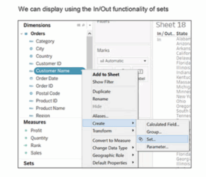
We can accomplish this with using the In/Out functionality of sets.
Here are the steps:
- Drag and drop the Customer Name in Rows shelf and Profit in Columns shelf to visualize.
- Then create a set by right clicking on Customer Name and selecting create option then hit on Set.
- Name the set as ‘Top Customers’. Configure the set by clicking on Top tab and selecting By field then fill in the values Top, 5, Profit, Sum. Similarly create other set with name ‘Bottom Customers’ and fill the By Field values as Bottom, 5, Profit, Sum.
- Select both sets and right click on it then use the option Create Combined Set. Give it a name of ‘Top and Bottom Customers’ and include all members from both sets. Pull the Top and Bottom Customers onto Filters.
- Here we go, the top five and bottom five are displayed.
- Is There a Difference Between Sets and Groups in Tableau?
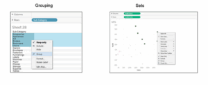
A Tableau group only goes one level up, and this is used to create an even higher level category by combining lower-level members of it, as compared to sets in Tableau which can have conditions and can be grouped by multiple dimensions/measures.
Example: Sub-category can be grouped by category.
Top Sales and profit can be grouped together for different categories by creating a set:
- To continue on example above of Sets, select the Bottom Customers that sets the arrangement based only on profit in customer names.
- Go to the ‘Groups’ tab and select the top five entries from the list.
- Right-click and select create a group option.
- In the same way, select bottom five entries and create their group. Hide all the other entries.
- Here is the key difference: the groups will have the same customers, irrespective of their later profits. Whereas for sets, any change in profits will lead to reordering of the top five and bottom five customers.
- What is the Difference Between Treemaps and Heat Maps?
Heat maps
A heat map is used for comparison between a few categories by means of color and size. In this we can consider two measures.
Scenario: Show the sales and profit in all the regions for products and sub-products.
Do the following:
a. Drag Region field to the Columns shelf, Category, and Sub-Category fields in Rows shelf.
b. Use the ShowMe tool and select the Heat Map.
c. One can see the hotter and colder regions in the produced heat map.
Heat map is not just defined by color but also can use its size. Here to define the size by sale, by dragging Sales tab to Size under marks card, compare profit and sales through color and size.
Tree Maps
- A Treemap represents hierarchical data. The space in the view is divided into rectangles sized and ordered by a measure.
- Scenario: Show sales and profit across all regions for categories and sub-categories of products.
- Select the two dimensions Category and Sub-Category
- Select the two measures from data pane Sales and Profit. Use the Show-me tool and choose tree-map.
- What is the Difference Between .twbx And .twb?
This is the question that is most asked during the Tableau interviews and has to be answered in detail.
.twbx
The .twbx has all the information needed for the visualization together with the data source to build it. This is called as packaged workbook and compresses the package of files all together.
.twb
The entire .twb instructions to interact with that data source will be present. It would look up the data source as soon as it builds an extract and visualization. This cannot be shared alone, as all it contains is only instructions, where the data source will have to be attached separately.
- What Will the Following Function Return?
Left(3, “Tableau”)
Choose the correct answer:
- Tab
- Eau
- Error
Can it be none of the above
It will return an error because it is wrong; here the correct syntax should be- left(string, num_chars), so it should have been Left(“Tableau,” 3).
Left returns specified number of characters from the start of the string given. If the right syntax is followed, it will return ‘Tab’.
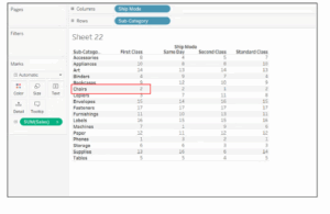
7. Find topline product subcategories based on sales for every delivery method. Which one ranks #2 on first-class ship mode?
- The visualization will first be drawn up using ship mode and below ship mode to ensure each method is called out.
- We shall proceed to take sales onto the visualization as a rank table calculation.
- Right-click on sales then click on Add Table Calculation and change Calculation Type to Rank.
- Table Down selected, and the data appears.
- In this case, what is the Rank function in Tableau?
The thing when one ranks something is assigning a place to something usually inside a category and based on a measure. Tableau has several ways to rank, such as:
- rank
- rank_dense
- rank_modified
- rank_unique
- Example stores:
Let us first understand how they rank up based on their sales:
- Drag Store field to Rows shelf and Sales field to markings card.
- Go ahead and create a Calculated Field and name it Rank. Use the formula: RANK (SUM(Sales))
- Bring Rank field to markings card.
- Double-click on Rank field, for you will then see the rank assigned to stores based on sales.
- Now duplicate the Rank field by right-clicking on it and selecting Duplicate. Name your copy as ‘Rank Modified’ and use the formula: RANK MODIFIED(SUM(Sales))
- Bring Rank Modified to the marks card to view the data.
- Repeat the same steps to create ‘Rank Dense’ and use the formula: RANK DENSE(SUM(Sales))
- Same way, ‘Rank Unique’ creation and use the following formula: RANK UNIQUE(SUM(Sales))
- How Would You React When Some Countries/Provinces (Any Geographical Entity) Are Missing, and Showing Null While Using a Map View?
By working on maps and geographical fields, you usually find unknown or ambiguous places are indicated in the bottom right corner of that view.
Click on the indicator and choose one of these options:
- Edit Locations- correct the locations by mapping your data to known locations
- Filter Data-excludes the unknown locations from the view using a filter. The locations will not be included in calculations.
- Show Data at Default Position- show the values at default position of (0, 0) on the map.
- How Do You Calculate Daily Profit Measures Using LOD?
- LOD expressions are a simplified method of using aggregated data to build bins, such as profit per day.
- Scenario: Evaluate our success in terms of total profit per business day.
- Create a calculated field called LOD – Profit per day with this formula:
- FIXED [Order Date]: SUM([Profit])
Furthermore, create another calculated field named LOD – Daily Profit KPI with this formula:
- IF [LOD – Profit per day] > 2000 then “Highly Profitable.”
- ELSEIF [LOD – Profit per day] <= 0 then “Unprofitable”
- ELSE “Profitable”
- END
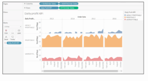
That is how to compute using LOD a daily profit measure. Then proceed to create the visualization:
- Bring YEAR(Order Date) and MONTH(Order Date) to the Columns shelf
- Drag Order Id field to Rows shelf. Right-click on it, select Measure and click on Count(Distinct)
- Drag LOD – Daily Profit KPI to the Rows shelf
- Bring LOD – Daily Profit KPI into marks card and change mark type from automatic to area.
And that would create the visualization:
- How Can You Schedule a Workbook in Tableau after Publishing It?
- Log into Tableau Server, and click on Content, either data sources or Workbooks, depending on what type of content you want to have up-to-date.
- Choose the checkbox for a data source or workbook that you want to have refreshed and choose Actions > Extract Refresh.
- In the Refresh Extracts dialog, choose Schedule a Refresh and complete the following steps:
- Choose the schedule you want.
- If available, specify whether you want a full or incremental refresh.
- How Do You Handle Null and Other Special Values?
If there are null values in the field or if no values exist on the logarithmic axis, then Tableau will be unable to plot.
An indicator appears in the lower right corner of the view, and selecting that will provide the below options:
Filter Data
Excludes the null values from the visualization using a filter. In that case, the null values are also excluded from any calculations used in the view.
- Show Data at Default Position
- Shows the values at a default location on the axis.
- How Can You Embed a Webpage in a Dashboard?
Follow these simple steps to embed a webpage in a dashboard:
- Go to dashboard
- Double click the ‘Webpage’ option available under ‘Objects.’
- Enter the URL (here https://en.m.wikipedia.org/wiki/) of the webpage in the dialog box that appears
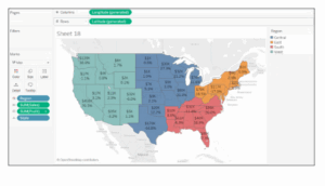
- Model a wok displaying Profit and Sales region wise.
Follow these simple steps to display profit and sale region wise-
- Drag Profit and Sales field to the Rows shelf
- Drag Region field to the Columns shelf
But for such Tableau interview questions, the interviewer may be looking for your mapping capabilities in Tableau. So, you need to follow these steps to show region wise profit and sales in a better way.
- Double click on the State field to get its view
- Go to Marks card and change the mark type from Automatic to Map.
- Bring Region field to Color on the Marks card
- Drag Profit, Sales, and State fields to Label on the Marks card
- This provides a better view on profits and sales region wise.
- What Are Some Ways to Optimize a Dashboard’s Performance?
Many ways have been used to optimum the performance of the dashboard such as:
a. Maximize on number fields and records. You can exclude unused fields from your visualization or use extract filters.
b. Limit the number of filters used, by avoiding quick filters and using action and parameter filters instead. These filters reduce query loads.
c. Use Min/Max instead of Average because average functions require more processing time than Min/Max
d. Use boolean or numerical calculations more than string calculations. Computers can process integers and boolean much faster than strings.
Boolean > int > float > date time > string
- Which visualization will be utilized in the provided scenarios?
To summarize the total sales by all product categories and also subcategories
To show an event or activity’s duration
To show profit growth by quarter
The following visualizations will be used for the above scenarios:
- Treemap
- Gantt chart
- Waterfall chart
- Discuss the importance of a data server in Tableau.
In Tableau, a data server has two jobs. The first job of a data server is to synchronize your data with the server, so that you can access datasets, past calculations, aliases, and definitions anywhere through a system. This would make any task more honest. So, it gives you security and quick access.
Secondly, when you have a data server, you can take all the data that you want to perform a visualisation or report to your local machine. With the support of the server, it is very easy to get from the internet.
- Tell the difference between discrete and continuous.
In Tableau, there are two types of dimension flow: discrete and continuous.
Discrete values are single points counted separately from a group of other issues, for example, the number of states in a country. Continuous values give a user the possibility to use values in a range that can be finite or infinite, for example, how a particular company’s stock price changes.
- Mention a story about Tableau as an instance
A story is just a collection of worksheets or dashboards that ultimately tells a message.
An example is two worksheets showing employee performance in a company; one with performance metrics and summaries at levels L1 to L3 while the same information is on the second worksheet for employees at levels L3 and L4-the direction upper management. This can give a broad view according to performance since everyone’s performance depends on others.
This is for when the worksheets have different parameters and measures.
- What is KPI in Tableau?
Key Performance Indicators by the Shapes card make use of Tableau for looking at how the company has performed on some of the main indicators:
- Creating a calculated field and marking its values as successful or unsuccessful with respect to the appropriate parameter.
- Use the dimension and the calculated field you produced to create a chart. Convert the view in marks into shapes.
- On-KPI shape cards, place success and failure for a clearer understanding.
- How to Create a Donut Chart in Tableau
Tableau does not have a direct way to make a donut chart; however, there are two ways to make it. If donut chart is for a page/sheet, it requires a pie chart with another measure added into the rows shelf, so two pie charts will appear on the sheet. Change the color of the smaller pie chart into the same one with the background and to be smaller. Right-click on the second instance in the rows shelf and select “dual axis”. Finally, remove any unnecessary details. The second way of creating a donut chart can be done only in a dashboard. First, create a pie chart in a sheet and import it into the dashboard, then cover it with a round image that has the same color as the background image in the middle.
- What is analysis in Tableau?
Tableau has provisions within it for tools that support the textual analysis in a chart. We have many tools, among them the average line adding to the chart. Once we drop the tool to the chart tableau does the math. There are tools that explore and inspect data such as clustering, percentages, making bands of a specific size, and so on. These tools are contained in every sheet built to render an analysis by utilizing an ‘Analyze’ tab. When they are applicable to be used on a worksheet, only then will the features show up.
- What is the quick filter in Tableau?
It allows the usage of a filter when you use Tableau, to trigger a flip in what these filters do. For example, you can turn it into a one-value dropdown, a single-value list, a multi-value list, a multiple-value drop-down list, or so on. Once we add a filter to a sheet, we can right-click on the sheet to see all the quick filter options. Change any of those options, and the way the filter appears on the sheet will change accordingly.
- What is tableau desktop?
Tableau Desktop is a product from Tableau that creates, edits, and keeps data visualizations locally on a system. Once it’s completed, or even midway, it allows the end-users to publish their work on a server, online, or even on the public Tableau server. Additionally, users of Tableau Desktop can edit any file made on another system using the same or a lower version of Tableau.
- How to figure out the percentage in Tableau?
To know how much your worksheet’s data contains. Access the percentage breakdowns through Analyze % in the left-hand pane. There, you’ll find many other percentage breakdowns, like percentage of table, row, column, row in pane, paned, column in pane, and cell. Select one of the above, and state the portion of total number the percentage is to be calculated against. There are no different options for rows and columns; what you select will be the same for all rows and columns.
- What does “tableau developer” mean?
The developer of tableau understands how to transform raw data into data visualizations and insights. A tableau developer must eventually create sophisticated dashboards that are easy for others to use so that they can easily glean understanding from data. - What is a tableau data engine?
Hyper, which is the in-memory Data Engine used by Tableau, makes importing data as easy as possible and fast to analyze. It lets the user create an extract file of a data set, which may be seen as a small version of the dataset that still carries all the data. It runs faster for different queries over the dataset. The application makes working with big datasets much easier for the user.
Also Read:
- Best Data Science Certifications 2025: Chart Your Data Path
- IBM Data Science Professional Certificate
- Top 10 Artificial Intelligence Companies in India
- This Data Science Skill Will 10x Your Salary – Learn It Now!
Boost Your Data Career with PW Skills’ Data Science Course
After going through this Tableau Interview Questions guide are you ready to supercharge your career? PW Skills’ Data Science Course isn’t just about coding—it equips you with real-world tools like Tableau, SQL, Git, React, and more. Whether you’re a student or working professional, it’s designed to help you build, analyze, and deliver end-to-end solutions confidently.
Join thousands of learners & make your data dreams real—enroll now!
Tableau Interview Questions FAQs
What’s the best way to prepare for Tableau interviews?
Practice using real datasets and revise key concepts like LODs, filters, and dashboard optimization.
Can Tableau be used without coding knowledge?
Absolutely! Tableau is designed with drag-and-drop features, perfect for non-programmers.
Is Tableau worth learning in 2025?
Yes. With data-driven decision-making becoming the norm, Tableau skills are in high demand.
What roles require Tableau skills?
Business Analysts, Data Analysts, Product Managers, Marketing Analysts, and more.


