Serif fonts are a popular example of fonts used to design webpages, marketing materials, and applications. These fonts add to the typography of the platform and are considered one of the most important tools. Whether you are designing a website or working on a project, choosing the right serif font can play a major role in your design and make it look more professional and appealing.
Here, let us learn about the different serif fonts that you might consider in your design.
What Is Font Type?
Fonts are of different types used on many pages, applications, and places. This text improves the appearance of the webpage elements. Different fonts have varying thickness, spacing styles, details, and more.
They are generally categorised into serif, sans-serif, script, display, and monospace styles. Designers choose one font type based on their requirements and the messages they want to deliver. Let us know what serif fonts are and their different types.
What is a Serif Font?
Serif fonts are font types that include small decorative strokes at the edges of the letters, which are known as Serifs. They are widely used in webpages, applications, card designs, and many other places. They are used because they are more readable, look professional, add personality, and work well for branding.
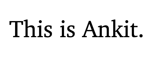
These fonts are considered to be a balanced option, much polished for visual hierarchy. Here, we will learn more about serif fonts and their types.
Read More: What Are The Font Families In HTML?
31 Serif Fonts To Add Value to Your Design
Let us check some of the major serif fonts that can be used in your design projects.
1. Times New Roman
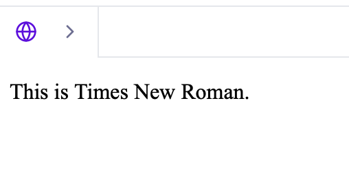
Times New Roman is one of the most widely used serif fonts in the world. It was originally created for the Times newspaper. It is also known for its narrow spacing, sharp serifs, and highly efficient use of space which makes it ideal for long text columns.
This serif font is formal, readable, and considered a universal standard in academic and business writing.
Syntax
| font-family: “Times New Roman”, serif; |
Example
| <p style=”font-family:’Times New Roman’, serif;”>This is Times New Roman.</p> |
2. Georgia
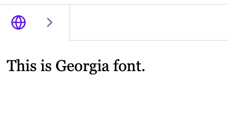
The Georgia serif font was designed to specifically enhance readability on low-resolution screens. Its larger x-height, wider letterforms, and warm curves make the text smooth and easy to read even on mobile devices.
These serif fonts look more professional but also friendly, making it perfect for blogs, websites, and digital publishing.
Syntax
| font-family: Georgia, serif; |
Example
| <p style=”font-family:Georgia, serif;”>This is Georgia font.</p> |
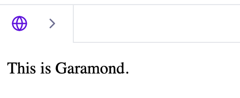
3. Garamond
Garamond is considered to be one of the popular serif fonts that represents a classic old-style serif with elegant curves and beautiful proportions.
It has a timeless bookish feel which you might often use in literature, novels, and high-end print design. Its contains thin strokes and graceful serifs that bring a sophisticated and traditional tone to any project.
Syntax
| font-family: Garamond, serif; |
Example
| <p style=”font-family:Garamond, serif;”>This is Garamond.</p> |
Read More: 10 CSS Tricks for UI Developers: Scale User Designing And Front End Development In 2025
4. Baskerville
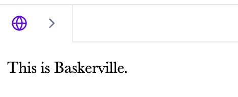
Baskerville is a serif font that offers sharp serif variants in font along with high stroke contrast. It delivers a refined appearance which is considered a “luxury” serif because of its classy and elegant finish.
Syntax
| font-family: Baskerville, serif; |
Example
| <p style=”font-family:Baskerville, serif;”>This is Baskerville.</p> |
5. Bodoni
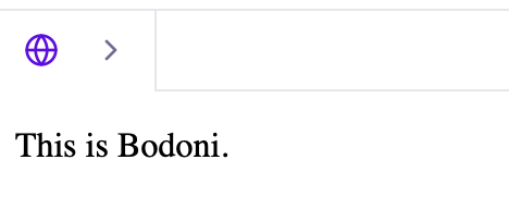
The Bodoni font is a modern serif known for its high end contrast between thick and thin strokes. It contains a stylish look which you might often find in magazine titles, fashion branding, and luxury logos. You might notice it for its bold, eye-catching, and great display usage.
Syntax
| font-family: Bodoni, serif; |
Example
| <p style=”font-family:Bodoni, serif;”>This is Bodoni.</p> |
6. Didotwa
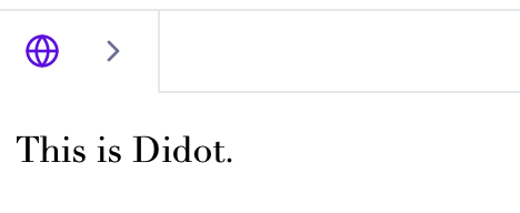
Didot is a French modern serif font with tall vertical lines and long, fine serifs. It looks clean, minimal, and luxurious. Many luxury fashion brands, including Vogue, use these font types and its inspired versions for headings and branding due to their elegant and premium feel.
Syntax
| font-family: Didot, serif; |
Example
| <p style=”font-family:Didot, serif;”>This is Didot.</p> |
7. Playfair Display
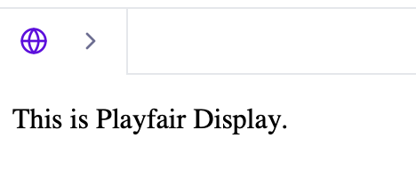
Playfair Display is a font that blends modern touch along with classical influences, featuring high contrast and stylish curves. It’s ideal for headlines, hero sections, and editorial designs on the web.
Syntax
| font-family: “Playfair Display”, serif; |
Example
| <p style=”font-family:’Playfair Display’, serif;”>This is Playfair Display.</p> |
8. Merriweather
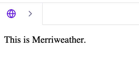
Merriweather is one among the many serif fonts designed for comfortable on-screen reading for users. It features strong shapes, moderate contrast, and slightly condensed letterforms.
This makes it a great option for serif inspired blogs, digital articles, and long-form content that must be readable on all screen sizes.
Syntax
| font-family: “Merriweather”, serif; |
Example
| <p style=”font-family:’Merriweather’, serif;”>This is Merriweather.</p> |
9. Cinzel
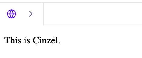
Cinzel is one of the most important serif fonts that takes inspiration from ancient Roman stone carvings. It adds authority due to its bold look that adds elegance to the design or platform. It works well for artistic posters, branding, movie covers, and anything that needs a classical or monumental tone.
Syntax
| font-family: Cinzel, serif; |
Example
| <p style=”font-family:Cinzel, serif;”>This is Cinzel.</p> |
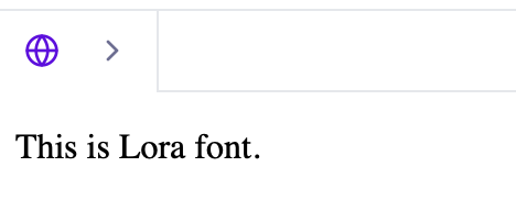
10. Lora
Lora tends to combine modern curves with traditional serif features, giving it a poetic and dynamic personality. Its balanced shapes make it perfect for the following including
- storytelling blogs
- creative writing sites
- contemporary editorial layouts.
Syntax
| font-family: Lora, serif; |
Example
| <p style=”font-family:Lora, serif;”>This is Lora font.</p> |
Read More: 5 Free UI UX Design Courses With Certificate: Are Free Courses Worth It?
11. Cormorant Garamond
Cormorant Garamond is a font style which is a little bit dramatic and an expressive serif font consisting of delicate strokes and graceful curves. It’s designed to look artistic and premium, making it ideal for boutique brands, packaging, and elegant editorial themes.
Syntax
| font-family: “Cormorant Garamond”, serif; |
Example
| <p style=”font-family:’Cormorant Garamond’, serif;”>This is Cormorant Garamond.</p> |
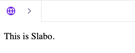
12. Slabo
Slabo is a unique serif font design because it is designed for specific sizes to maintain sharpness and clarity. This makes it ideal for advertisements, headings, and product descriptions where precision is important.
Syntax
| font-family: Slabo, serif; |
Example
| <p style=”font-family:Slabo, serif;”>This is Slabo.</p> |
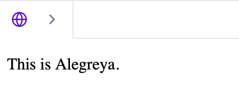
13. Alegreya
Alegreya is preferred because it has a natural flow that mimics handwriting rhythm, making it highly readable for long texts. It has a lively, human feel, which makes it perfect for literature, essays, and educational websites.
Syntax
| font-family: Alegreya, serif; |
Example
| <p style=”font-family:Alegreya, serif;”>This is Alegreya.</p> |
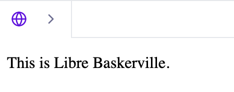
14. Libre Baskerville
Libre Baskerville is a font language that modernizes the original Baskerville to enhance screen readability. It has slightly taller letters and softer serifs, making it a perfect choice for digital body text that still needs a classic tone.
Syntax
| font-family: “Libre Baskerville”, serif; |
Example
| <p style=”font-family:’Libre Baskerville’, serif;”>This is Libre Baskerville.</p> |
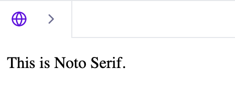
15. Noto Serif
Noto Serif is a font type that belongs to the massive Noto font family, which supports nearly all languages. It’s clean, balanced, and ideal for multilingual websites, international brands, and global publications.
Syntax
| font-family: “Noto Serif”, serif; |
Example
| <p style=”font-family:’Noto Serif’, serif;”>This is Noto Serif.</p> |
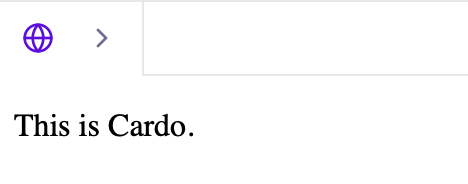
16. Cardo
Cardo is a font design that gives a scholarly and historic feel, making it ideal for academic publishing, ancient texts, religious documents, and classical literature. It carries a traditional tone with excellent readability.
Syntax
| font-family: Cardo, serif; |
Example
| <p style=”font-family:Cardo, serif;”>This is Cardo.</p> |
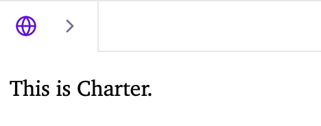
17. Charter
Charter is a serif font design that is sturdy, clean, and optimized for low-quality printing and digital screens. It balances sharpness and readability perfectly, making it a top choice for magazines, journals, and long documents.
Syntax
| font-family: Charter, serif; |
Example
| <p style=”font-family:Charter, serif;”>This is Charter.</p> |
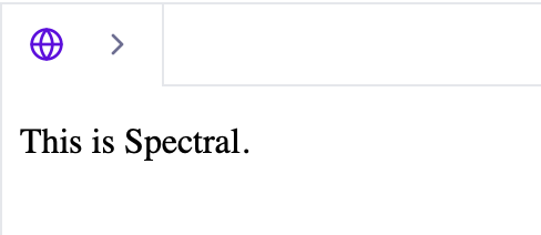
18. Spectral
Spectral is a versatile serif font having sharp, strong shapes, suitable for both text and display. It gives a modern, confident impression, making it excellent for editorial design, academic use, and digital publications.
Syntax
| font-family: Spectral, serif; |
Example
| <p style=”font-family:Spectral, serif;”>This is Spectral.</p> |
Read More: HTML address tag: Syntax, Components, Attributes, And Examples [2025]
19. EB Garamond
EB Garamond is a font style in serif fonts that replicates the original Garamond with attention to detail, delivering a beautiful, classic serif ideal for book-like designs, elegant typography, and vintage branding.
Syntax
| font-family: Spectral, serif; |
Example
| <p style=”font-family:Spectral, serif;”>This is Spectral.</p> |
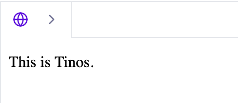
20. Tinos
Tinos is a highly readable serif font style and is designed to render consistently across platforms. Its clean, neutral design is perfect for corporate websites, business documents, and general-purpose reading.
Syntax
| font-family: Tinos, serif; |
Example
| <p style=”font-family:Tinos, serif;”>This is Tinos.</p> |
21. PT Serif
PT Serif is one of the serif font styles that supports Cyrillic and multiple world languages, featuring modern cuts with classic inspiration. It has a professional, approachable feel suitable for news sites, blogs, and corporate branding.
Syntax
| font-family: “PT Serif”, serif; |
Example
| <p style=”font-family:’PT Serif’, serif;”>This is PT Serif.</p> |
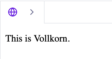
22. Vollkorn
Vollkorn is a bold, chunky, and expressive font design in serif. It contains heavy strokes, making it excellent for impactful headings, bold titles, and designs that need a strong visual presence.
Syntax
| font-family: Vollkorn, serif; |
Example
| <p style=”font-family:Vollkorn, serif;”>This is Vollkorn.</p> |
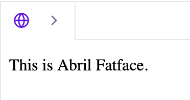
23. Abril Fatface
Abril Fatface is a serif font style that is inspired by advertising posters of the 1800s. It contains strong curves and dramatic contrast, and it adds personality and flair to titles, magazine covers, and branding.
Syntax
| font-family: “Abril Fatface”, serif; |
Example
| <p style=”font-family:’Abril Fatface’, serif;”>This is Abril Fatface.</p> |
24. Bitter
Bitter is one of the most effective serif fonts design that is a contemporary serif designed specifically for digital reading. It is sturdy, clean, and optimized for body text on websites and apps, offering superb clarity even at small sizes.
Syntax
| font-family: Bitter, serif; |
Example
| <p style=”font-family:Bitter, serif;”>This is Bitter.</p> |
Read More: What is CSS? Cascading Style Sheet Explained for Beginners and Professionals
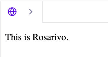
25. Rosarivo
Rosarivo is an elegant font design and refined with soft curves. It eliminates a luxurious feel, making it suitable for invitations, wedding cards, premium branding, and fine print.
Syntax
| font-family: Rosarivo, serif; |
Example
| <p style=”font-family:Rosarivo, serif;”>This is Rosarivo.</p> |
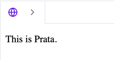
26. Prata
Prata is a font design that offers high contrast and stylish serifs similar to modern display typefaces. It works efficiently and is appealing for striking headlines, especially in fashion, editorial, and lifestyle designs.
Syntax
| font-family: Prata, serif; |
Example
| <p style=”font-family:Prata, serif;”>This is Prata.</p> |
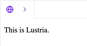
27. Lustria
Lustria is one of the best serif fonts that balances simplicity and elegance, making it a great choice for both headings and body text. It feels modern yet classical and is ideal for clean, minimal websites.
Syntax
| font-family: Lustria, serif; |
Example
| <p style=”font-family:Lustria, serif;”>This is Lustria.</p> |
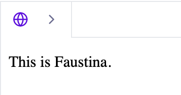
28. Faustina
Faustina has a friendly font design kept mainly to look comfortable for reading. It’s widely used in editorial layouts, newspapers, and long-text publishing thanks to its clear letterforms.
Syntax
| font-family: Faustina, serif; |
Example
| <p style=”font-family:Faustina, serif;”>This is Faustina.</p> |
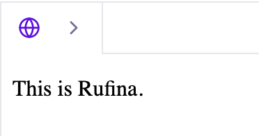
29. Rufina
Rufina is another type of appealing font in the Serif font directory. Its unique curves and strong contrast make it excellent for premium branding, beauty products, fashion sites, and editorial titles.
Syntax
| font-family: Rufina, serif; |
Example
| <p style=”font-family:Rufina, serif;”>This is Rufina.</p> |
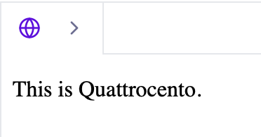
30. Quattrocento
Quattrocento has a classical appearance inspired by Renaissance typography. Its clear lines make it a great serif for websites, headings, and readable paragraph text.
Syntax
| font-family: Quattrocento, serif; |
Example
| <p style=”font-family:Quattrocento, serif;”>This is Quattrocento.</p> |
Read More: Beginner HTML And CSS Projects: Top 10 Easy HTML & CSS Projects for Beginners
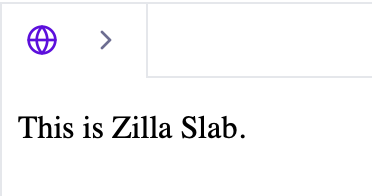
31. Zilla Slab
Zilla Slab is a bold serif font with powerful block-like serifs. It gives a confident and modern look, perfect for branding, tech websites, and strong digital identities.
Syntax
| font-family: “Zilla Slab”, serif; |
Example
| <p style=”font-family:’Zilla Slab’, serif;”>This is Zilla Slab.</p> |
Serif fonts FAQs
Q1. What is a serif font?
Ans: Serif fonts are font types that include small decorative strokes at the edges of the letters, which are known as Serifs. They are widely used in webpages, applications, card designs, and many other places.
Q2. Is Arial a serif font?
Ans: No, Arial is not a serif font as it does not contain any decorative strokes at its letters' feet.
Q3. How to know if a font is serif?
Ans: If a font has a decorative stroke in the legs of the letter, it is considered as a serif family font.


