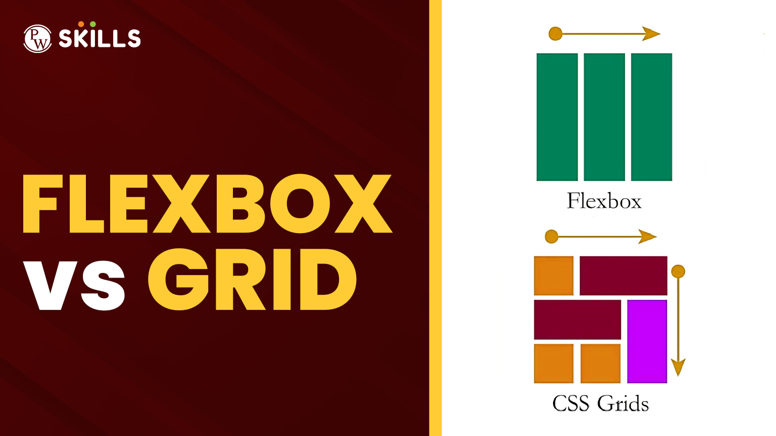
How would you go about deciding flexbox or grid for your layout? This is usually the question on every learner’s mind even with Google. If it sounds like you, then this guide is going to transform everything.
Let us now set aside the confusion of Flexbox vs Grid and acquaint you-this could be the first real project to a student or a career restructurer of an advanced UI-when to use which tool and why.
1. The CSS Layout System: What Are We Really Talking About?
Before going into Flexbox and Grid comparison, let’s look at the broader picture. The CSS layout system has changed a lot throughout the years. There are no more floats and clearfix hacks. Nowadays, we rely on two modern layout models for our main layout:
- Flexbox (Flexible Box Layout): One dimensional layout (row or column).
- Grid (CSS Grid Layout): two-dimensional layout (rows and columns).
They are both part of the CSS layout system, but their capabilities and purposes differ. Understanding these differences is key to mastering css grid vs flexbox.
2. Flexbox vs Grid: A Quick Primer
The simplest principle for deciding:
- Use Flexbox while laying out items into one axis – that is, a row or a column.
- Apply Grid when you are working with both rows and columns at the same time.
That’s pretty much the gist of Flexbox vs Grid, but we will have to go deeper with real cases.
3. Use Case Breakdown: When to Use What
A. Flexbox Shines in Simpler, Linear Layouts
For arranging navigation bars, buttons, or cards, either in a single row or single column, Flexbox is just the go-to. It’s ideal for aligning, distributing, and spacing items without the overhead of defining grid lines.
B. Grid Rules in Complex Web Pages
Want to build a magazine-style layout with several rows and columns? A kind of dashboard that holds sections of varying sizes? CSS Grid is your hero right here. Because in this case, you control both axes precisely, and that’s where Flexbox vs Grid differences really show up.
4. Code Examples to Bring It Home
Flexbox Example:
.container {
display: flex;
flex-direction: row;
justify-content: space-between;
}
Great for horizontal navigation menus.
Grid Example:
.container {
display: grid;
grid-template-columns: 1fr 2fr;
grid-template-rows: auto;
}
Perfect for complex multi-column layouts.
Both methods are critical in the modern CSS layout system.
5. Grid vs Flexbox Performance: Does Speed Matter?
Now discussing the differences in performance between Grid and Flexbox indeed. The truth is that the performance differentials here are negligible at best; however:
- Simple layouts tend to perform faster with Flexbox because of lesser computation overhead.
- There might be a slight weight-increase on Grid but definitely worth it for architectured-heavy, complex UIs.
Unless you’re building an ultra-high-performance app, this shouldn’t be a deciding factor.
6. Responsive Design: Who Does It Better?
Here’s where the game gets interesting. Flexbox organizes content that shrunken grow naturally. Think of a group of buttons that depending on the size of the device, change in size. CSS Grid is perfect when you know how the exact layout will be across devices.
They’re both pretty good for responsive purposes-but Flexbox vs Grid will just be a matter of how much control you need.
7. Combining Both: The Secret Sauce
Here’s a little insider tip-you do not have just one choice. Many modern websites use Flexbox inside Grid or the other way around. .
For instance:
- Outer layout: CSS Grid.
- Inner components (like navbar, cards): Flexbox.
That’s the magic of mastering the CSS layout system: knowing when and how to blend tools.
Flexbox vs Grid in CSS
| Use Case | Flexbox | CSS Grid |
| One-dimensional layout | Best fit | Not ideal |
| Two-dimensional layout | Limited | Excellent |
| Content-based sizing | Good | Good |
| Complex layouts | Overkill | Best fit |
| Performance (simple layout) | Slightly better | Good |
| Responsiveness | Natural fit | Structured control |
Real-World Scenario: A Portfolio Website
Let’s say you’re designing a portfolio site:
- Header and footer – Flexbox.
- Main content section with projects – CSS Grid.
- Cards inside each project – Flexbox again.
This combo approach optimizes both performance and layout clarity.
Now, think of how powerful you become once you stop seeing Flexbox vs Grid as a debate and start seeing it as a toolbox.
Common Mistakes to Avoid
- Forcing Flexbox to Work into a Grid-like Layout.
- Making over-complicated UI designs simple with Grid.
- Not testing responsiveness on different devices.
- Not considering browser compatibility (though almost all browsers support this now).
These are some pitfalls that would make you a cleverer developer and a better designer when stuck to choose between Flexbox vs Grid.
Level Up with PW Skills
Viewing them as complementary tools with the larger CSS layout system makes your designs smart, fast, and intuitive. Whether you’re a budding front-end developer or a pro UI designer, you’ll future-proof your career by learning how to master css Flexbox vs Grid layouts.
Ready to build scaling UIs that really can perform really well in real applications?
PW Skills’ Full Stack Development Course helps you go from a developer who “just knows CSS” to one who builds full-stack applications with confidence.
Learn all tools—all in one place. Your tech stack just got smarter. Enroll now and take your skills to the next level.
FAQs
Is Flexbox easier than Grid?
Yes, for beginners and simple layouts. But both are essential tools in a developer’s kit.
Can I use Flexbox inside Grid?
Absolutely. Many production websites combine both.
Which is better for mobile-first design?
Flexbox often adapts better for content-first, mobile-focused layouts.
Are Grid and Flexbox the only modern layout options?
They are the most efficient and widely supported layout systems today.
Is there a performance difference?
For most practical use cases, performance differences are negligible.


