CSS Units help web design look consistent and clean. There are several units you can choose in Cascading Style Sheet to ensure your layouts adapt well to different screen sizes, maintaining proper consistency.
When you are designing a website, proper unit allocation is important for a proper layout. Whether it is margin, font sizes, setting padding, or other visual modifications in web elements. CSS units help decide how big or small a web element should appear based on different screen sizes. Here, let us learn more about CSS units in detail.
What Are CSS Units?
CSS Units are metrics that define the different dimensions of the stylesheet, including width, height, margins, font sizes, and more. Different web elements can be scaled and ensure flexibility with these units in action.
CSS consists of different units for expressing values, such as px, rem, em, and more. There are many web elements, including margin, padding, and width, that accept different types of CSS units to ensure proper layout and responsiveness. Now, there are two main categories of CSS Units.
Types of CSS Units
The two major types of CSS units define how the screen measurements are defined i,e. Either fixed or depending on the viewport.
- Absolute CSS units
- Relative CSS units
1. Absolute Units
The Absolute units in CSS contain or define fixed values which does not change depending on the viewport or screen elements. They include cm, px, mm, and more, which are not altered or changed with different web elements or screen viewports. Generally, absolute units are not recommended for websites that have viewers from mobile as well as desktop. They work best when the output system is familiar or known.
| Absolute CSS Units | Full Form |
| px | Pixels (1 px = 0.26mm) |
| cm | Centimeters (1 cm = 1/100m) |
| mm | Milimeters ( 1 cm = 10 mm)
1 mm = 1/10 cm |
| pt | Points (1 pt = 1/72 inch ( 1 inch = 2.54cm)
1 pt = 1.33 px |
| in | inches |
| pc | picas |
1. px (pixels)
A pixel is commonly used CSS unit mainly for font size adjustments, defining margins, paddings, and more. Pixels are fixed-sized measurements which does not change with the screen size or other web elements.
It is the smallest unit in digital screens, representing merely a point on the screen. The more pixels there are on screen, the higher the resolution of the screen.
| p {
font-size: 16px; } |
Here, pixel is used to define the font size of a paragraph element to ensure it looks the same on all devices.
Read More: Responsive Design with CSS: Complete Guide to Modern Web Development in 2025
2. cm (Centimeters)
The centimeter type unit in CSS is used to measure the elements based on real world sizes. It is a unit in the SI system used to measure length i,e. 1 meter = 100 cm. As there are many differences between screen resolutions and the real-world size of an element.
| p {
font-size: 5 cm; } |
Here, the paragraph element font-size is defined using the centimeter unit.
3. mm (Millimeters)
The millimeter is also a real world unit, but smaller than a centimeter. 1 centimeter is equal to 10 millimeters. This is used to add the assigned value around the element.
| p {
font-size: 50 mm; } |
4. pt (Points)
The points metric is a traditional CSS unit where there are 72 points in an inch i,e. 1/72 of an inch.
| h1 {
font-size: 24pt; } |
This sets the size of the <h1> heading tag to 24 pt i,e. 32 pixels in length.
2. Relative Units
The relative CSS units are not fixed like absolute units; rather, they are flexible depending on the screen sizes or the viewport. They specify lengths relative to another element’s length i,e. Viewport, root element or parent elements.
| Relative CSS Units | Description |
| em | This unit is relative to the font size of the parent element |
| ex | The ex unit is based on the x-height of the font. (Not Frequently Used) |
| ch | The ch unit is relative to the width of the zero character of the current character i,e. “0” |
| fr | The fr relative CSS units are an abbreviation of “fraction” used frequently for grid layouts |
| rem | This unit is relative to the root font size in the HTML document. It disconnects dependency on the parent element. |
| vw | This css unit stands for viewport width, which is relative to 1% of the viewport. |
| vh | It stands for Viewport height. This is relative to 1% height of the viewport |
| vmin | It is relative to 1% of the viewport’s smaller dimension. |
| vmax | It is relative to 1% of the viewport’s larger dimension. |
| % | This CSS unit is relative to the size of the parent element. |
1. em
The em unit can be used to set the font size of an element relative to the parent element it belongs to. It is a frequently used CSS unit for creating flexible, responsive, and scalable websites.
Suppose the font size of the body element of a web page is 20px, then you can define the sizes of other elements based on this parent element.
| body {
font-size: 20px; } h1 { font-size: 2.5em; /* 2.5 x 20 = 50px */ } h2 { font-size: 1.7 em /* 1.7 x 20 = 34px */ } p { font-size: 1 em; /* 1 x 20 = 20px */ } |
Here, the web elements like h1, h2, and p are defined using the em unit, which depends on the parent element size i,e. <body> tag.
2. ex
This relative CSS unit is used to set the x-height of the current font. It is used for font related measurements, including vertical spacing. The lowercase letters are taken as a reference for height. This relative unit is not commonly used.
| p {
font-size: 20px; line-height: 2ex; /* Line height is twice the height of lowercase ‘x’ */ } |
3. rem
The rem CSS unit is used to define the font size based on the root of the <HTML> elements. It removes the dependency of the elements on the parent element. This relative css unit is useful when you want a consistent size throughout your website.
| html {
font-size: 16px; } h1 { font-size: 2rem; /* 2 x 16 = 32px */ } p { font-size: 1rem; /* 1 x 16 = 16px */ } |
Here, the font size is set to 16 px, which defines the sizing of font size for other elements.
4. vw or view width
This depends on the viewport width, which changes with the different screen sizes. 1 vw equals 1% of the browser’s visible width on the screen.
| div {
width: 50vw; height: 10vw; } |
Here, the width of the “div” element takes up to 50% of the viewport’s width. It adjusts its presence based on the browser window.
5. vh or Viewport Height
The vh stands for viewport height where 1vh equals to 1% of the browsers visible height on the screen. It is useful for responsive design of webpages where elements can be scaled based on window size.
| section {
height: 100vh; background-color: lightblue; } |
Here, the element height i,e. 100vh is used to fill the entire height of the screen
6. vmin or vmax
The vmin or vmax CSS units are used to define the font size based on the smaller or larger side of the viewport.
- The vmin unit is relative is 1% of the smaller side of the viewport.
- The vmax unit is relative to 1% of the larger side of the viewport whichever is width or height.
| div {
width: 50vmin; /* 50% of the smaller viewport dimension */ height: 50vmin; } |
Here, the width is dependent on the smaller viewport dimension taking upto 50% width.
| div {
width: 50vmax; height: 50vmax; } |
Here, the width is dependent on the larger viewport dimension, taking up to 50% width or height, whichever is larger.
Example of Absolute CSS Units
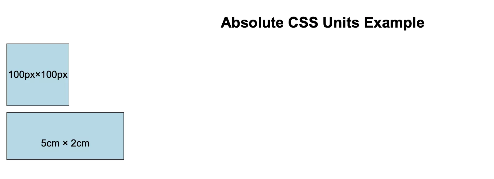
Let us get a better insight into the absolute unit with pixel (px), example given below.
Absolute CSS Example
Check the given example below, where we are defining the size of two boxes using the px absolute CSS unit.
HTML Code
| <!DOCTYPE html>
<html lang=”en”> <head> <meta charset=”UTF-8″> <meta name=”viewport” content=”width=device-width, initial-scale=1.0″> <title>Absolute CSS Units Example</title> <link rel=”stylesheet” href=”style.css”> </head> <body> <h2>Absolute CSS Units Example</h2> <div class=”box px”>100px×100px</div> <div class=”box cm”>5cm × 2cm </html> |
CSS Code
| body {
font-family: Arial, sans-serif; padding: 20px; } h2 { text-align: center; } .box { background-color: lightblue; margin: 10px 0; line-height: 100px; text-align: center; border: 1px solid #333; color: #000; } /* Absolute units */ .px { width: 100px; height: 100px; } .cm { width: 5cm; height: 2cm; } .mm { width: 50mm; height: 20mm; } .pt { width: 100pt; height: 50pt; } .in { width: 2in; height: 1in; } .pc { width: 10pc; height: 5pc; }
|
Output
 |
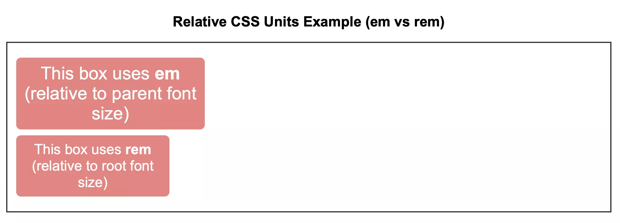
Relative CSS Example
HTML Code
| <!DOCTYPE html>
<html lang=”en”> <head> <meta charset=”UTF-8″> <meta name=”viewport” content=”width=device-width, initial-scale=1.0″> <title>Relative CSS Units Example</title> <link rel=”stylesheet” href=”style.css”> </head> <body> <h2>Relative CSS Units Example (em vs rem)</h2> <section class=”parent”> <p class=”em”>This box uses <strong>em</strong> (relative to parent font size)</p> <p class=”rem”>This box uses <strong>rem</strong> (relative to root font size)</p> </section> </body> </html> |
CSS Code
| html {
font-size: 16px; /* Root font size */ } body { font-family: Arial, sans-serif; padding: 20px; } h2 { text-align: center; } .parent { font-size: 20px; /* Parent font size */ border: 2px solid #333; padding: 15px; } p { background-color: lightcoral; color: white; margin: 10px 0; padding: 10px; text-align: center; border-radius: 8px; } /* Relative units */ .em { font-size: 1.5em; width: 10em; } .rem { font-size: 1.5rem; width: 15rem; } |
Output
 |
Master Complete Full Stack Development With PW Skills
Master Web Development with frontend and backend skills with PW Skills Full Stack Web Development Course. Gain in-depth concepts of web development along with hands on learning based on capstone projects. Enroll in this course and get interactive coursework with industry led live sessions and recorded format lectures.
Strengthen your concepts using practice exercises, real world projects, module assignments, and more. Get industry recognised certification after completing the course modules only at pwskills.com
CSS Units FAQs
Q1. What are CSS units?
Ans: CSS units are used to define measurements of web elements, including height, margins, width, font sizes, and more.
Q2. What is an absolute css?
Ans: The Absolute units in CSS contain or define fixed values which does not change depending on the viewport or screen elements. They include cm, px, mm, pt, and more.
Q3. How many types of units are there in CSS?
Ans: There are two different types of units in CSS i,e. Absolute units and relative units.
Q4. What is an em unit in CSS?
Ans: The em unit can be used to set the font size of an element relative to the parent element it belongs to. It is relative to the font size of the parent element.

