Have you heard of the CSS Flexbox? Popular as a flexible box layout structure in web development. It is a structuring model used to arrange items inside a container, either in a horizontal or vertical direction. CSS flexbox also gives you the flexibility and responsiveness in a website.
CSS Flexible layout can give a container the ability to adjust its width or length to the best available space suitable for display devices and screen sizes. Here, we will learn more about the CSS flexbox layout and how we can implement this flexbox layout in our webpage design.
What Is CSS Flexbox Design?
The CSS Flexbox design is a module that defines a CSS Box model that helps to design responsive and flexible web design without using any float or positioning techniques.
- CSS Flexbox, the Flexible Box layout, is a one-dimensional CSS layout model designed for arranging items in rows or columns.
- You can use CSS Flexbox to align and arrange items in one dimension, i,.e either a row or a column.
- The CSS Flexible box layout makes the container flexible and responsive without using positioning or float.
- The CSS Flexbox is a one-dimensional layout having only rows or columns.
- With CSS Flexbox, you can align and distribute space among items in a container, even without knowing the exact dimensions.
Read More: How To Add Comments In CSS For You And Other Developers?
Components of CSS Flexbox
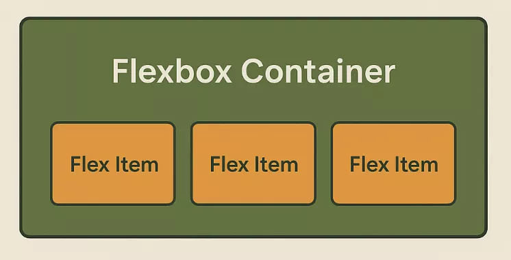
The two major components of CSS Flexbox are given below.
- Flexbox Container: This component is the parent element where the display property of the flexbox is defined or implemented, i.e., flex, or inline-flex.
- Flex Items: The flex items are the direct children of the flex container, which automatically generate into flex items.
Read More: Flexbox vs Grid in CSS: 7 Clear Ways to Decide When to Use What
CSS Flexbox Layout Properties
Check some of the major CSS flexbox properties given below.
1. Parent Flex Container
The parent flex container is used to define a container that enables a flex context for its direct child elements. It is applied using the following syntax.
| container {
display: flex or inline-flex; } |
When the parent becomes a flex context, all its direct children become flex items, which can be arranged using the flexbox properties.
2. Children Flex Items
The children flex items in CSS are the direct child elements kept inside a flex container. They are the elements or items that are directly affected by the flex properties. You can make them grow or shrink within the flex container based on your requirements.
| <div class=”container”>
<div class=”item1″>Item 1</div> <div class=”item2″>Item 2</div> <div class=”item3″>Item 3</div> </div> |
3. flex-direction
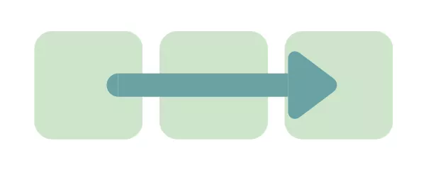
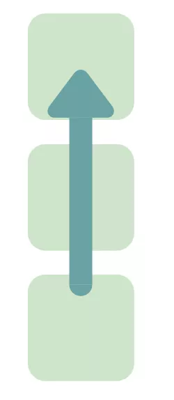
The flex-direction property in CSS flexbox is used to define the direction of the main axis, along with the flex items that are kept inside the container. It controls the order of how elements are arranged in a row or column. It can take the following values.
- row
- row-reverse
- column
- column-reverse
| .container {
display: flex; flex-direction: row; } |
4. flex-grow

The flex-grow property in CSS (Cascading Style Sheet) is used to define how a flex item should grow relative to the other items inside the same container. It can have any numerical values between 0, 1, 2, and so on.
| .item1 {
flex-grow: 1; } .item2 { flex-grow: 2; } |
5. flex-basis Property
The flex-basis property is used to define the size of an item in terms of spacing. The default value is set to “auto” before any extra space is distributed by flex-grow or flex-shrink. It sets the starting point for the spacing.
| .box1 {
flex-basis: 100px; /* starts with width 100px */ } .box2 { flex-basis: 200px; /* starts with width 200px */ } .box3 { flex-basis: auto; /* size based on content or width */ } |
6. align-items
This property of CSS Flexbox layout is used to align all the flex items on the cross axis. You can set the following value inside the “align-items”.
- stretch
- flex-start
- flex-end
- start
- end
- center
- baseline
- last baseline
7. Justify-content
This property is used to align the items on the main axis, in which flex-direction has to be set for the flow. You can set the following value for the justify-content
- start
- end
- left
- right
- normal
- flex-start
- flex-end
- center
- space-around
- space-between
- space-evenly
- stretch
Read More: Types Of CSS Colors In Web Development
8. Flex-shrink
This property of CSS Flexbox is used to define the ability of flex items to shrink when the space is very limited. Here, the negative numbers are invalid.
| .item {
flex-shrink: 3; } |
9. flex-wrap
This CSS Flexbox property is present by default, where the flex items will try to fit into one single line. You can make these items to wrap as needed. You can implement the following values inside.
- nowrap
- wrap
- wrap-reverse
Example of CSS Flexbox Layout Using the flex-element
Let us take this example where there are three boxes (div element) arranged in a horizontal manner. These boxes are flexbox items where you can define the growing pattern of each box.
HTML
| <!DOCTYPE html>
<html lang=”en”> <head> <meta charset=”UTF-8″> <meta name=”viewport” content=”width=device-width, initial-scale=1.0″> <title>Flexbox Example</title> <link rel=”stylesheet” href=”style.css”> </head> <body> <div class=”container”> <div class=”box box1″>Box 1</div> <div class=”box box2″>Box 2</div> <div class=”box box3″>Box 3</div> </div> </body> </html> |
CSS
| .container {
display: flex; flex-direction: row; justify-content: space-around; align-items: center; height: 300px; background-color: #f0f0f0; border: 2px solid #ccc; } .box { color: white; font-size: 20px; text-align: center; padding: 20px; border-radius: 10px; } .box1 { background-color: #ff595e; flex-grow: 1; } .box2 { background-color: #1982c4; flex-grow: 2; } .box3 { background-color: #6a4c93; flex-grow: 1; } |
Output
 |
Here, in this example, we are taking 3 box items with different flex-grow values.
- In the container, we are using the “display: flex”, which makes the container a flex container.
- The first and third boxes contain “1” as the value of “flex-grow”, while the second box contains “2” as the value.
- These metrics control how each box grows when the screen size changes.
- Box 2 grows twice when compared to the other two boxes when the screen size changes.
CSS Flexbox Vs. CSS Grid
In modern web design practice, both CSS flexbox and grid are used. They make the website more flexible, responsive, and user friendly at the same time.
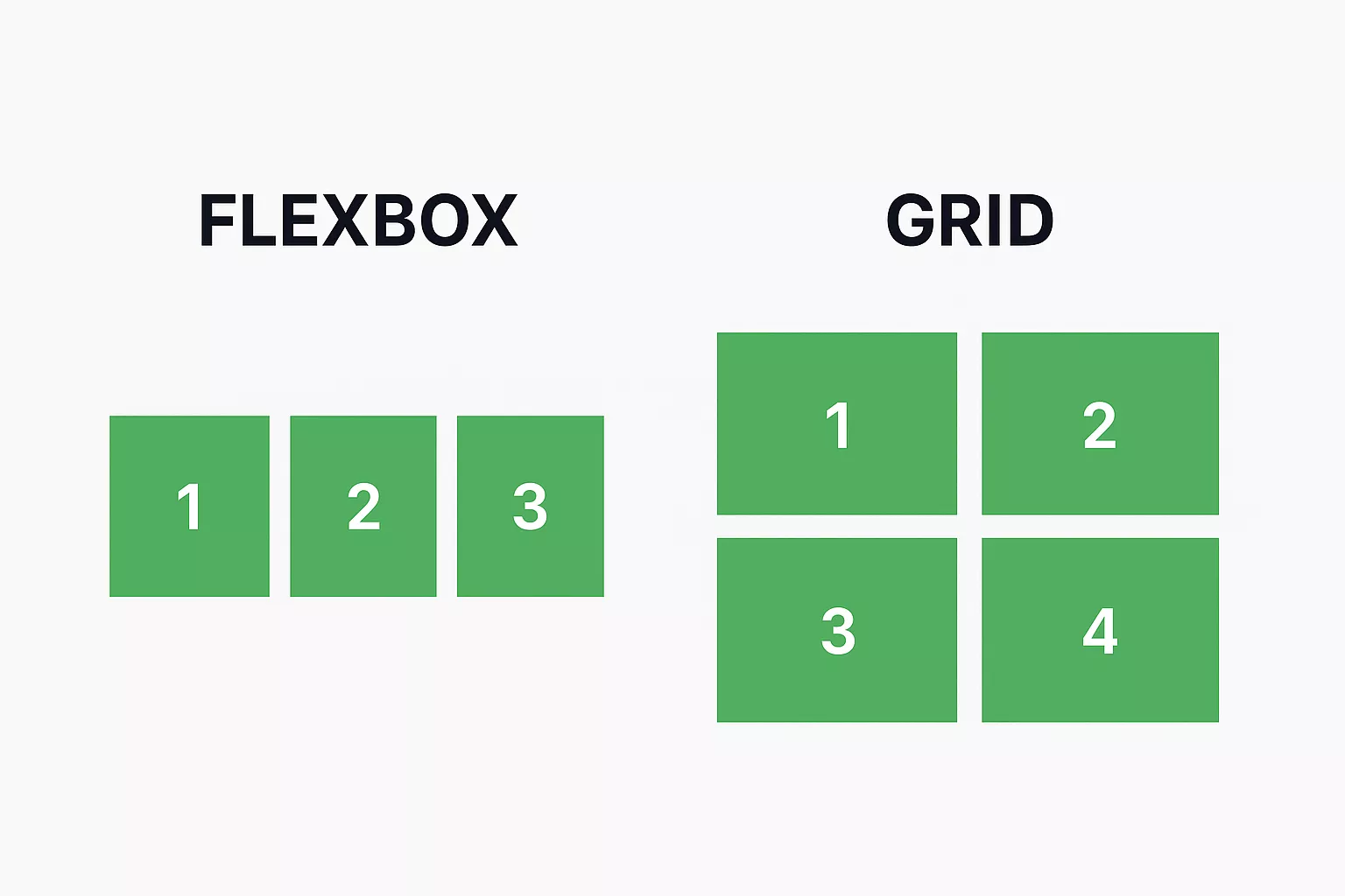
There are some major differences between these two properties in CSS (Cascading Style Sheet), which must be known to anybody interacting with the HTML code.
- CSS Flexbox is one-dimensional, while CSS Grid works for two-dimensional structures.
- Flexbox is generally used for better alignment of items or elements of a webpage, while Grids are used for making complex web layouts, and more.
- The Flexbox items flow along one direction, while the Grid defines an entire layout area in both directions.
CSS Flexbox Layout FAQs
Q1. What is a CSS Flexbox?
Ans: CSS Flexbox is a layout model that defines how elements inside a container align or space themselves in different screen sizes. You can use CSS Flexbox to align and arrange items in one dimension, i,.e. either a row or column.
Q2. Why use CSS Flexbox?
Ans: CSS Flexbox can be used to align and distribute space among items in a container, even without knowing the exact dimensions.
Q3. Is Flexbox still used in 2025?
Ans: CSS flexbox is still used in many places to define the spacing and alignment of elements within a container in either horizontal or vertical space.
Q4. Which is better, CSS Grid or flexbox?
Ans: CSS grid lets you arrange the layout in a two-dimensional space, unlike CSS flexbox, where you have the flexibility to define only the one-dimensional space. When you need a simple layout style, you can use CSS flexbox.

