Have you ever wondered how different website designs have different types of boxes around their content? This is where the CSS Box Model comes in. The CSS box model helps you to understand how boxes around text, images, and other elements are created and styled. By learning about the CSS Box Model, you’ll understand how to control spacing, borders, and more to make your website look just the way you want.
In this article, we will walk through the basics of the CSS Box Model, making it easy for you to understand how it works and how you can use it in your own web design projects. So, without wasting any time, let’s begin with the article.
CSS Box Model – Key Takeaways
- Understanding what the CSS Box model is.
- Getting familiar with the working of CSS box model
- Understanding the example of CSS box model.
- Learning about CSS box-sizing and its types.
What Is CSS Box Model?
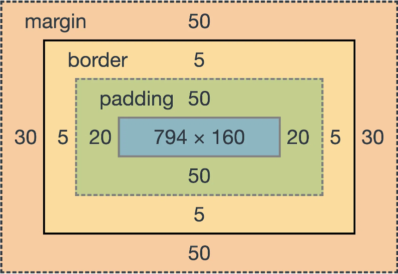
The CSS box model is a way to understand how elements are arranged and displayed on a web page. This model is basically like a box that contains several different parts including – the content, padding, border, and margin. Let’s understand what does each of them means-
- Content: This is where your main content like- text or images will go.
- Padding: It is the space around the content inside the box.
- Border: It is the line that goes around the padding.
- Margin: The space outside the border that separates the box from other elements.
The CSS box model generally helps designers in creating and controlling the layout of web pages by adjusting these parts. Below is a detailed diagram from simplilearn that will help you to understand this concept in a better way.

Working Of CSS Box Model
The working of a CSS box model mainly revolve around its four parts, Let’s go through each part of the box model and see how it affects the website design layout:
- Content: This is the place where your main content goes. This content can be in the form of text, images, videos or something else. The size of a content box mainly depends upon the amount of text or a size of image you are choosing.
- Padding: This is the space between the content and the border. If you increase the padding, the space around the content inside the box will increase. Adjusting the padding generally helps in making the content look better and cleaner so that the user can read it with ease.
- Border: The border basically surrounds the padding. You can change the color, style, and thickness of the border according to your choice and content demand. If you make the border thicker, it will take up more space around the padding.
- Margin: The margin is the space outside the border. If you increase the margin, the space between the two boxes will increase. This basically helps in placing elements nicely on the page without letting them being too close to each other.
Example Of CSS Box Model
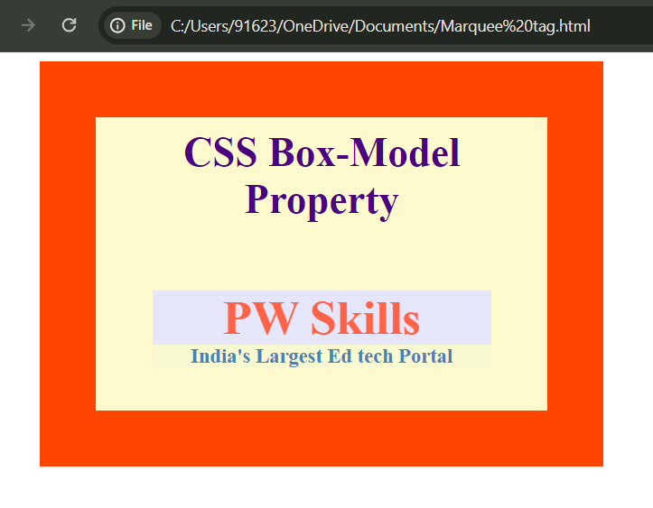
Let us look into an example of CSS box model to understand how the different parts of this are used on a webpage. The CSS box model is like a framework that helps you to design and organize elements on a page. By looking at a simple example, you can see how each part of the box model, like margins, borders, padding, and content, works together. This will make it easier for you to use the CSS box model on your own website to create a clean and attractive design.
| Example Of CSS Box Model |
| <!DOCTYPE html>
<head> <title>CSS Box Model</title> <style> .main { font-size: 36px; font-weight: bold; text-align: center; color: #4B0082; margin-bottom: 20px; } .pw { margin-left: 60px; border: 50px solid #FF4500; width: 300px; height: 200px; padding: 50px; padding-top: 10px; text-align: center; background-color: #FFFACD; position: relative; } .pw1 { font-size: 42px; font-weight: bold; color: #FF6347; margin-top: 60px; background-color: #E6E6FA; } .pw2 { font-size: 18px; font-weight: bold; color: #4682B4; background-color: #FAFAD2; } </style> </head> <body> <div class=”pw”> <div class=”main”> CSS Box-Model Property </div> <div class=”pw1″> PW Skills </div> <div class=”pw2″> India’s Largest Ed tech Portal </div> </div> </body> </html> |
| Output-
|
Why Box Model Is Important?
Understanding the CSS Box Model is important because it helps you to design web pages better. By knowing how each part of the box affects the overall layout, you can make sure that your web page looks the way you want it to. You can adjust the spacing, add borders, and position elements neatly by using this model.
CSS Box Sizing
CSS box sizing is a fundamental concept in web design that helps you to control the size of elements on a webpage. When you create a box using HTML and CSS, the box has a width, height, padding, border, and margin. How these different parts are calculated together to determine the overall size of the box depends on the box-sizing property. Let’s explore in detail below about- what box-sizing is, how it works, and why it’s important.
What Is Box Sizing?
When you set the width and height of an element, CSS only considers the content inside the box. However, in reality, the box also includes padding and borders, which can make it bigger than you expect. This is where the `box-sizing` property comes into play.
Types of Box Sizing
There are two main values for the `box-sizing` property, let explore and understand each of them:
1. content-box (default)
2. Border-box
1. Content-Box (Default)
When you use `box-sizing: content-box`, the width and height you set for an element only apply to the content inside the box. The padding and border are added extra to this width and height which can make the box larger than expected. Let us understand this with an example-
| Content Box Sizing |
| .element {
width: 200px; height: 100px; padding: 20px; border: 10px solid black; box-sizing: content-box; } |
In this example:
- The content is 200px wide and 100px tall.
- The padding 20px and border 10px are added on top of this, so the total size of the box becomes larger.
- 200px+20px+20px(padding of two sides)+10px+10px(border of two sides) = 260px wide.
- 100px + 20px + 20px(padding of other two sides of the box) + 10px + 10px(border of other two sides) = 160px tall.
2. Border-Box
When you use `box-sizing: border-box`, the width and height you set will include the content, padding, and border. This makes it easier to control the size of the box because the padding and border are part of the total width and height. Let us understand this with the help of an example-
| Border Box Sizing |
| .element {
width: 200px; height: 100px; padding: 20px; border: 10px solid black; box-sizing: border-box; } |
In this example:
- The total width of the box is 200px, and the total height is 100px.
- The padding of 20px and border 10px are included within this size, so the content area becomes smaller, but the overall box size stays as you set it.
- The padding of 20px + 20px and the border 10px + 10px (two sides of the square) is included in the width which will reduce the total fixed width of the content area to = 200px – 60px = 140px (width of content area).
- Similarly, the height of the content area will also be reduced to 40px (100px – 60px) as the padding and border of other two sides of the box are included in this.
Learn Web Development With PW Skills
Are you looking to start your career as a full stack developer but are confused with too many courses available online? Don’t worry we got you covered with our PW Skills Comprehensive Full Stack Development Course.
The key features of this comprehensive course that make it a standout choice in the market include-
- Support of expert mentors.
- Working on advanced real-world problems with Expert Developers
- Daily assignments.
- 24X7 doubt assistance.
- PW advanced lab and compiler for Code practice.
- Daily code quizzes at PW lab.
- Dedicated student community channel.
- Recorded lectures for flexibility.
- 250+ coding problems to solve.
- Soft skill training to build your confidence.
- 100% Placement assistance guarantee
- Certification upon completion and much more.
CSS Box Model FAQs
How does padding affect the box size?
Padding increases the size of the box from the inside. If you add padding to an element, the total size increases by the amount of padding. For example, if an element has 20px padding, its content area becomes larger by 20px on each side.
How does the Box Model affect the size of an element?
The size of an element is determined by its width and height plus the padding, border, and margin. For example, if you set an element’s width to 100px, and it has 10px padding, 5px border, and 15px margin, the total width will be 100px (content) + 20px (padding of two sides) + 10px (border of two sides) + 30px (margin of two sides) = 160px.
What role does the margin play in the Box Model?
The margin is the space outside the border that creates separation between elements. It doesn't affect the size of the element itself but pushes neighboring elements away, creating space around the element.


