CSS Tricks can be very useful when designing a responsive and attractive website. CSS stands for Cascading Style Sheet, which is used to style and attract the user’s attention. Using CSS, you can easily adjust font size, weight, colors, background images, and links, and build a responsive website design.
Mastering CSS skills is important for frontend developers or UI Designers in the industry. In this article, let us learn about some of the best CSS tricks which can speed up your front end development.
Also Read 💡: Rise of ChatGPT in Digital Marketing – PW Skills Provide Free Masterclass on 11th Jan, Register Now
CSS Tricks To Improve Your Front End Development
Getting familiar with CSS tricks can help you enhance your UI development game and attract user’s attention.
1. Smooth Scrolling
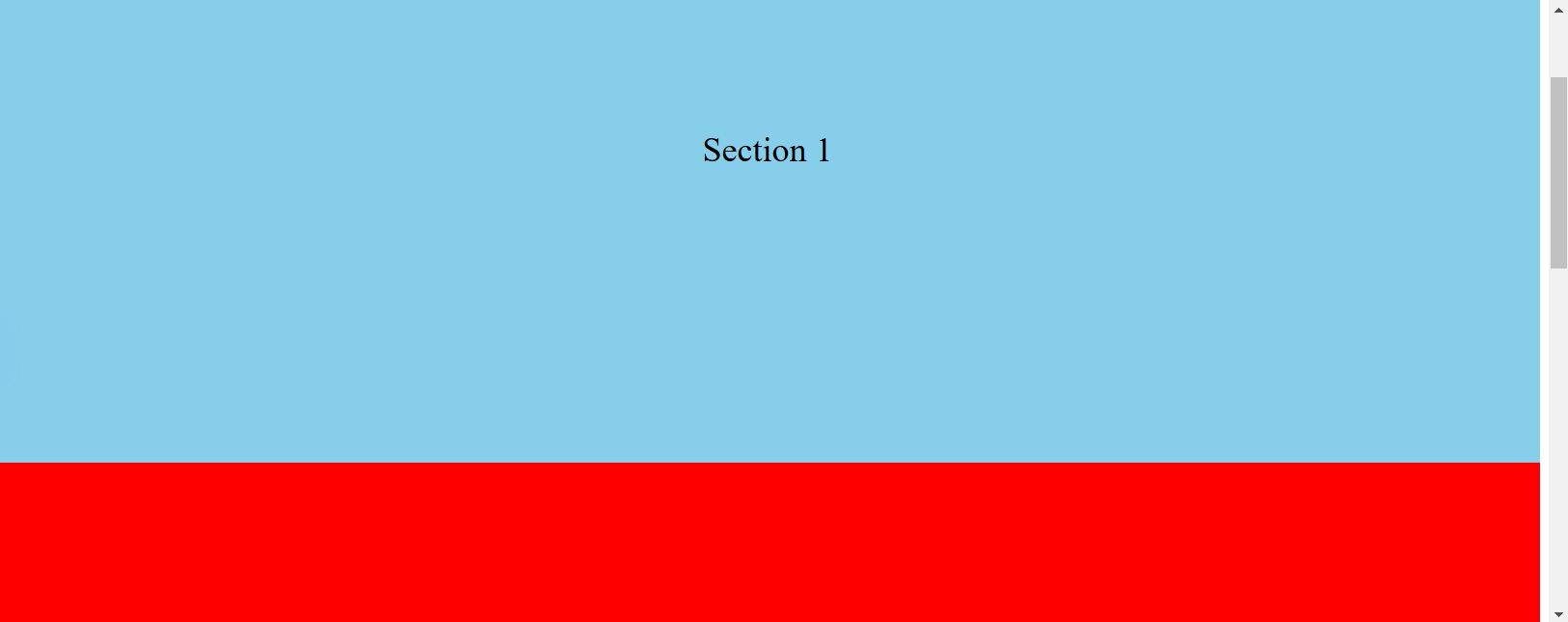
The smooth CSS tricks help you enable smooth scrolling for anchor links. You do not have to jump directly to the target and the pages scroll smoothly, which increases user experience.
| <!DOCTYPE html>
<html lang=”en”> <head> <meta charset=”UTF-8″> <meta name=”viewport” content=”width=device-width, initial-scale=1.0″> <title>Smooth Scrolling</title> <style> html { scroll-behavior: smooth; /* Enables smooth scrolling */ } section { height: 100vh; display: flex; justify-content: center; align-items: center; font-size: 2rem; } nav a { margin: 0 10px; text-decoration: none; color: blue; } </style> </head> <body> <nav> <a href=”#section1″>Section 1</a> <a href=”#section2″>Section 2</a> <a href=”#section3″>Section 3</a> </nav> <section id=”section1″>Section 1</section> <section id=”section2″>Section 2</section> <section id=”section3″>Section 3</section> </body> </html> |
2. Hover Effects on Buttons
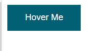
This is one of the most popular css tricks which can enhance your user interface by a significant amount and make your web page attractive. You can easily style your buttons with hover effects. This effect changes the background color when hovered. Check a simple example below.
| <!DOCTYPE html>
<html lang=”en”> <head> <meta charset=”UTF-8″> <meta name=”viewport” content=”width=device-width, initial-scale=1.0″> <title>Button Hover Effect</title> <style> .button { background-color: #008CBA; border: none; color: white; padding: 15px 32px; text-align: center; text-decoration: none; display: inline-block; font-size: 16px; margin: 4px 2px; cursor: pointer; transition: background-color 0.3s ease; /* Smooth transition */ } .button:hover { background-color: #005f73; /* Color changes on hover */ } </style> </head> <body> <button class=”button”>Hover Me</button> </body> </html> |
Before Hover

After Hover
3. Custom Checkbox Styling
This CSS trick is used to hide the default checkbox input and use a styled label as a custom design for the checkbox on the front end.
| <!DOCTYPE html>
<html lang=”en”> <head> <meta charset=”UTF-8″> <meta name=”viewport” content=”width=device-width, initial-scale=1.0″> <title>Custom Checkbox</title> <style> input[type=”checkbox”] { display: none; /* Hides default checkbox */ } label { position: relative; padding-left: 25px; cursor: pointer; user-select: none; } label:before { content: “”; position: absolute; left: 0; top: 0; width: 20px; height: 20px; border: 2px solid #000; background-color: #fff; } input[type=”checkbox”]:checked + label:before { background-color: #000; /* Fills box when checked */ } </style> </head> <body> <input type=”checkbox” id=”checkbox”> <label for=”checkbox”>Check me</label> </body> </html> |
Before Selection
The box stays empty by default with this CSS trick and when clicked the box gets filled with the chosen color.

After Selection

4. CSS Grid Layout
This CSS trick can be used to create a flexible and responsive grid layout using CSS grid properties.
| <!DOCTYPE html>
<html lang=”en”> <head> <meta charset=”UTF-8″> <meta name=”viewport” content=”width=device-width, initial-scale=1.0″> <title>CSS Grid Layout</title> <style> .grid-container { display: grid; grid-template-columns: repeat(auto-fill, minmax(100px, 1fr)); /* Auto-adjust grid */ gap: 10px; padding: 10px; } .grid-item { background-color: #4CAF50; color: white; text-align: center; padding: 20px; font-size: 30px; } </style> </head> <body> <div class=”grid-container”> <div class=”grid-item”>1</div> <div class=”grid-item”>2</div> <div class=”grid-item”>3</div> <div class=”grid-item”>4</div> <div class=”grid-item”>5</div> <div class=”grid-item”>6</div> </div> </body> </html> |
5. Text Shadow Effect
This CSS effect is used to add a shadow effect to text and give it a 3D or glowing appearance.
| <!DOCTYPE html>
<html lang=”en”> <head> <meta charset=”UTF-8″> <meta name=”viewport” content=”width=device-width, initial-scale=1.0″> <title>Text Shadow Effect</title> <style> h1 { text-align: center; margin-top: 20%; font-size: 4rem; color: #333; text-shadow: 2px 2px 5px rgba(0, 0, 0, 0.3); /* Adds shadow */ } </style> </head> <body> <h1>Shadow Text</h1> </body> </html> |
6. Consistent Theme with CSS
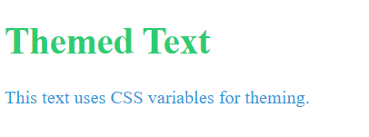
This CSS trick is used to define in: root for consistent them across the website design.
| <!DOCTYPE html>
<html lang=”en”> <head> <meta charset=”UTF-8″> <meta name=”viewport” content=”width=device-width, initial-scale=1.0″> <title>CSS Variables</title> <style> :root { –primary-color: #3498db; /* Define primary theme color */ –secondary-color: #2ecc71; /* Define secondary theme color */ –font-size: 18px; } body { color: var(–primary-color); /* Apply theme colors */ font-size: var(–font-size); } h1 { color: var(–secondary-color); } </style> </head> <body> <h1>Themed Text</h1> <p>This text uses CSS variables for theming.</p> </body> </html> |
7. Sticky Navigation Bar
This is used to keep the navigation bar fixed at the top when scrolling the page.
| <!DOCTYPE html>
<html lang=”en”> <head> <meta charset=”UTF-8″> <meta name=”viewport” content=”width=device-width, initial-scale=1.0″> <title>Sticky Navbar</title> <style> body { margin: 0; font-family: Arial, sans-serif; } .navbar { position: sticky; top: 0; background-color: #333; color: white; padding: 10px 20px; text-align: center; } .content { padding: 15px; height: 1500px; /* Creates scrollable content */ } </style> </head> <body> <div class=”navbar”>Sticky Navbar</div> <div class=”content”>Scroll to see the sticky navbar in action.</div> </body> </html> |
8. Text Typing Animation
This effect is used to animate text and give a loading effect of texts on the screen. This can be used in introductions, headers, or for frequent notices.
| <!DOCTYPE html>
<html lang=”en”> <head> <meta charset=”UTF-8″> <meta name=”viewport” content=”width=device-width, initial-scale=1.0″> <title>Typing Animation</title> <style> .typing { font-size: 2rem; font-family: monospace; white-space: nowrap; overflow: hidden; width: 0; animation: typing 4s steps(30, end), blink 0.5s step-end infinite alternate; border-right: 2px solid black; } @keyframes typing { from { width: 0; } to { width: 15ch; } /* Adjust to the text length */ } @keyframes blink { from { border-color: transparent; } to { border-color: black; } } </style> </head> <body> <div class=”typing”>PW Skills!</div> </body> </html> |
Before the text loads

After the Text loaded

9. Flip Card Effect
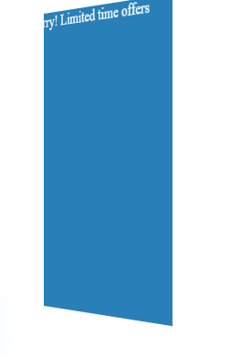
This effect can easily be implemented using the CSS framework. With this effect, you can easily flip on the two sides of the cards while hovering with the mouse. It is one of the most popular CSS tricks effect used by UI designers.
| <!DOCTYPE html>
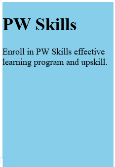
<html lang=”en”> <head> <meta charset=”UTF-8″> <meta name=”viewport” content=”width=device-width, initial-scale=1.0″> <title>Flip Card Effect</title> <style> .card { width: 200px; height: 300px; perspective: 1000px; } .card-inner { position: relative; width: 100%; height: 100%; transition: transform 0.6s; transform-style: preserve-3d; } .card:hover .card-inner { transform: rotateY(180deg); } .card-front, .card-back { position: absolute; width: 100%; height: 100%; backface-visibility: hidden; } .card-front { background-color: #bbb; color: black; } .card-back { background-color: #2980b9; color: white; transform: rotateY(180deg); } </style> </head> <body> <div class=”card”> <div class=”card-inner”> <div class=”card-front”>Front</div> <div class=”card-back”>Back</div> </div> </div> </body> </html> |
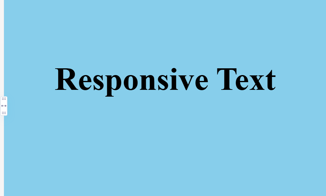
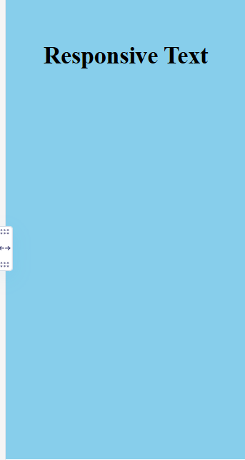
10. Responsive Text with CSS
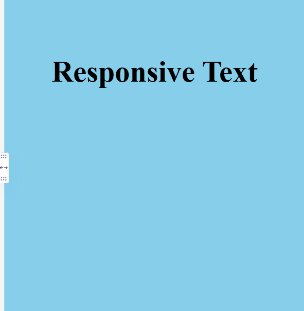
This CSS Tricks effect makes text scale dynamically with different screen sizes of the screen or devices. It adjusts the same format whether there is a difference in breadth and height.
| <!DOCTYPE html>
<html lang=”en”> <head> <meta charset=”UTF-8″> <meta name=”viewport” content=”width=device-width, initial-scale=1.0″> <title>Responsive Typography</title> <style> h1 { font-size: 10vw; /* Scales with viewport width */ text-align: center; margin-top: 20%; } </style> </head> <body> <h1>Responsive Text</h1> </body> </html> |
How to Level Up Your CSS Tricks & Skills?
CSS can greatly enhance your web development and UI designing game. However, mastering CSS requires constantly updating and implementing effects on different elements.
- Visit the CSS documentation. Look for the CSS Tricks and styling you have not used till now and try to implement them in your web development projects or User interface designing elements.
- Practice, practice, and practice using CSS styling in your web projects or UI interfaces.
- Closely observe the effect of every CSS styling and maintain a note separately to be used afterward.
- Always stay curious and keep an eye on new properties and techniques.
- You can also stay connected with the web development community and share any new tricks in the community to enhance your knowledge and help your fellow developers.
Also Read 💡: AI for Finance: PW Skills Free MasterClass on 11th January, Apply Now!
Learn User Interface Designing With PW Skills
Become a skilled User Interface designer with PW Skills 6 months UI UX Design Course. The course provides in-depth learning of important concepts of user interface designing, user experience designing, tools, and real-world projects. Attend industry-led live sessions and recorded sessions.
Also, get doubt support and strengthen your concepts with practice exercises and module assignments. Prepare for your interviews and discover a wide range of career opportunities only on pwskills.com
Also Read 💡: Building ECommerce React Application – Free Masterclass on 12th Jan, Register Now!
CSS Tricks FAQ
Q1. What is the full form of CSS?
Ans: CSS Full form stands for Cascading Style Sheet used to style web page.
Q2. How many ways can we add CSS in HTML?
Ans: There are three methods of integrating CSS in web development projects i,e. Inline, external and style sheets.
Q3. What is CSS used for?
Ans: CSS is a framework used for styling and enhancing the appearance of a website by styling its elements like font, border, text, background, links, sections, images, etc.
Q4. Can a CSS file contain HTML tags?
Ans: Any external CSS file must not contain any HTML tags as their extension itself is .css used to store CSS elements inside.

